
illustrated wedding invitations – access card
on this week’s #tbt #fbf post, i will be explaining the access card in the illustrated wedding invitation series.
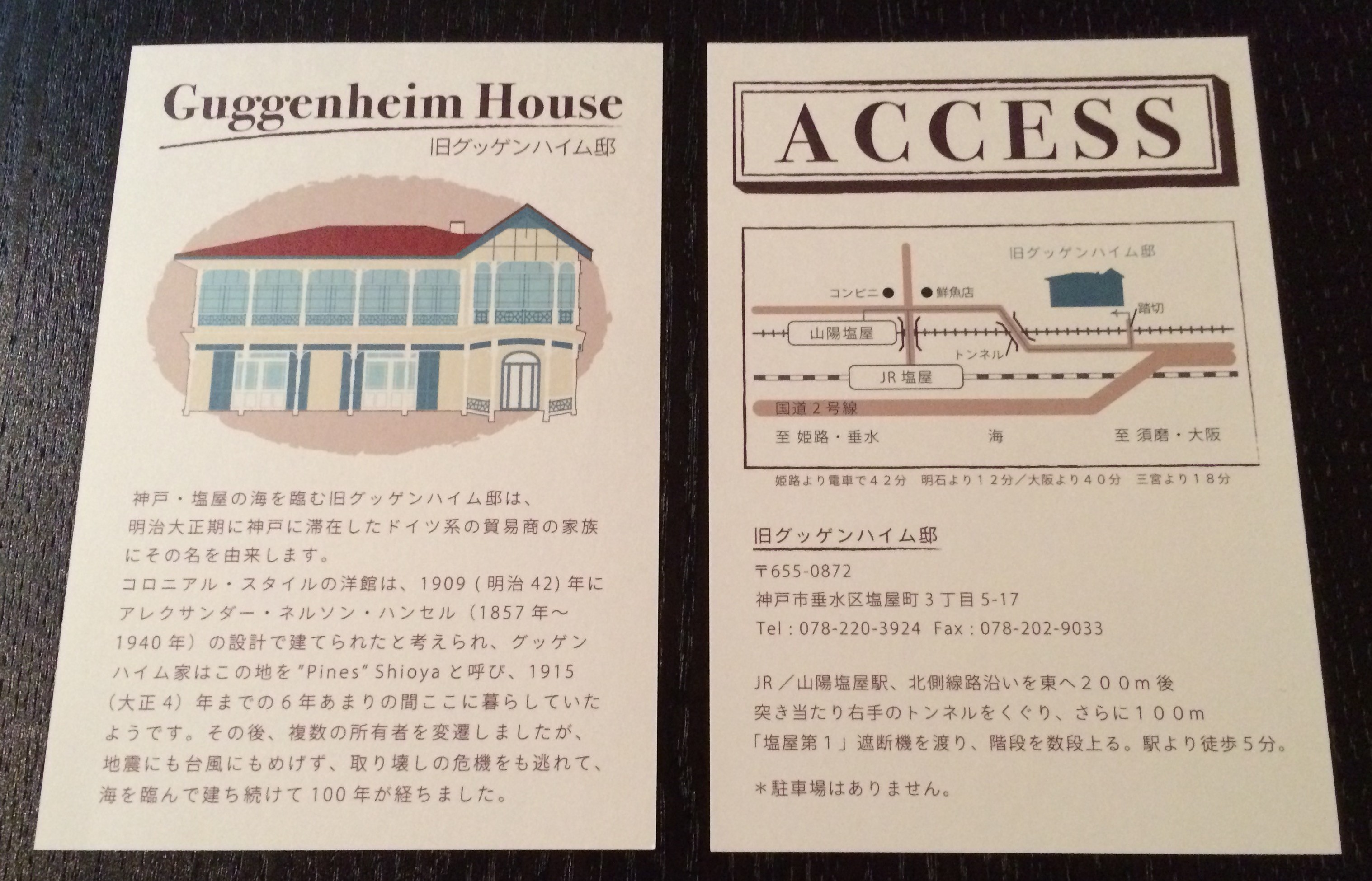
今週の #tbt #fbf もイラスト風ウェディング招待状セットの続きをご紹介いたします。今回はアクセスカード!
![[WEDDINGS] ILLUSTRATED ACCESS CARD](http://www.peacelovetokyo.com/home/wp-content/uploads/2015/07/IMG_6170-e1436466025778-323x400.jpg)
often times i see invitations that use the map straight off of a venue’s website. which is fine, but it doesn’t always match the theme of the invite itself and just doesn’t seem to fit in. it’s very simple to re-work a map and i really believe that this attention to such a minor detail will take an invitation set to a different level.
招待状セットで良く見る光景なのですが、アクセスマップをそのまま会場のホームページからコピー&ペーストしている事があります。そうしますと、画質が不十分だったりカラーなどが招待状のテーマと合わないケースが多く、とってももったいなく感じます。そこで、私は必ずテーマに合わせたフォントやカラーを使用し作り直します。小さなディテールですが、細部までこだわる事によって、より一層デザインがまとまるのです。
![[WEDDINGS] ILLUSTRATED ACCESS CARD](http://www.peacelovetokyo.com/home/wp-content/uploads/2015/07/IMG_6169-e1436465980888-286x400.jpg)
for this access card, i spent a lot of time reproducing the Guggenheim House in digital illustration form. it is somewhat monotonous, but so much fun (for me at least!) to repeatedly draw lines and shapes evenly. call me crazy, but it’s so therapeutic! 🙂
アクセスカードで時間をかけた部分はこちらです!旧グッゲンハイムハウスをデジタルで再現しました。単純作業ではありますが、たくさんの線や形を繰り返し並べていくのが、どこか癒される作業でもあり、とっても楽しいのです。?