
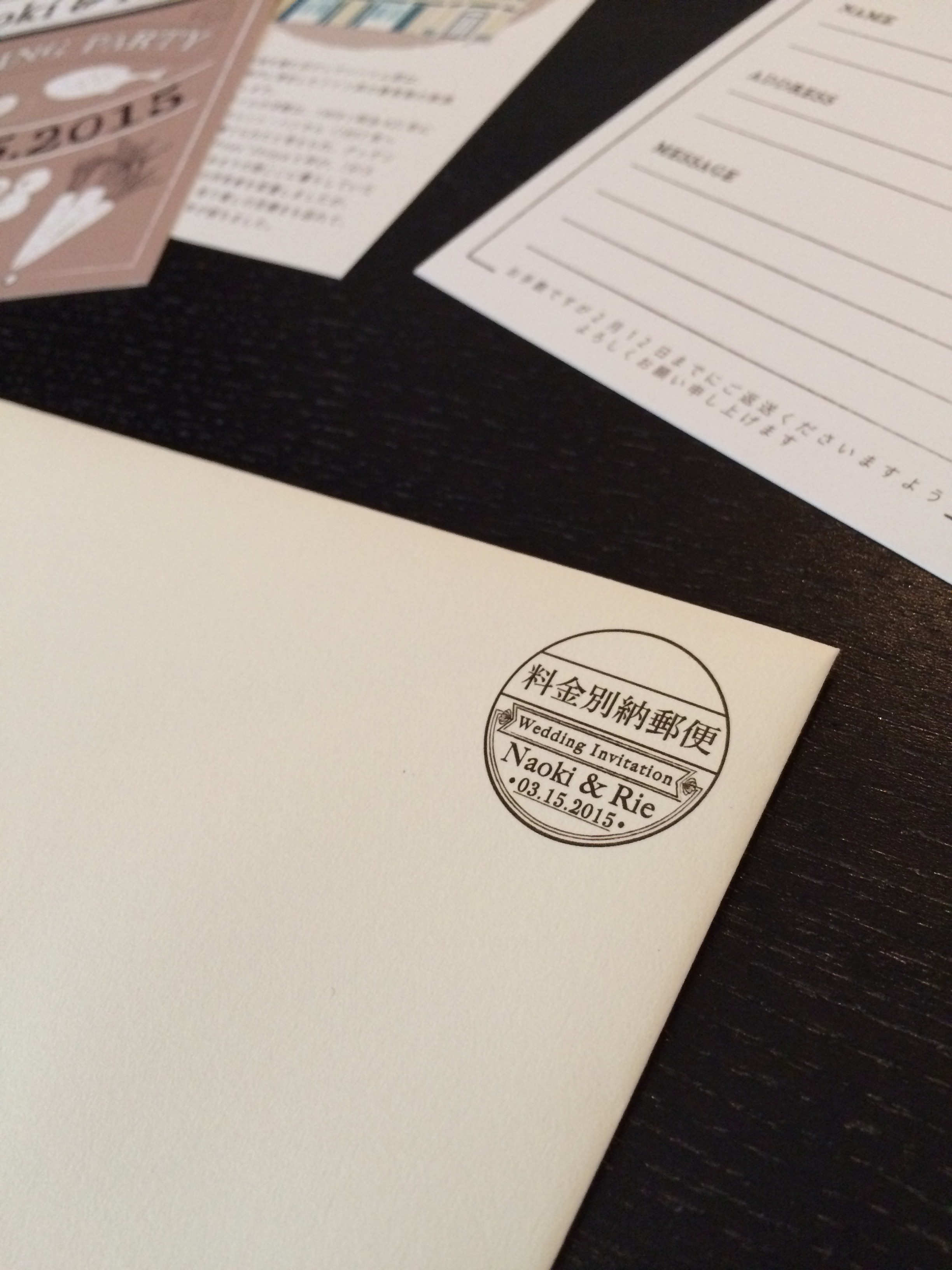
illustrated wedding invitations – envelope
today for #tbt #fbf, i introduce the final piece of the illustrated wedding invitations! the envelope and postage stamp.
今日の #tbt #fbf は、イラスト風招待状シリーズの最終で、封筒をご紹介します!料金別納表示を特別にデザインいたしました。
![[WEDDINGS] ILLUSTRATED ENVELOPE](http://www.peacelovetokyo.com/home/wp-content/uploads/2015/07/IMG_6229-e1437107081256-400x349.jpg)
working on this project, i had learned for the first time that designing an original postage stamp was even possible! how sweet is having your own wedding postage stamp?? my clients were so thrilled with how it turned out. when they took it to the post office, the postman even complimented them!
今回の招待状を作るのがきっかけで料金別納表示をデザインする事が可能だというのを初めて知りました。ウェディング招待状で二人のオリジナル料金別納マークを持てるというのは本当に嬉しい事ですよね!お二人は仕上がりをとても気に入っていくださり、更に郵便局で招待状を出した際も褒められたらしく、自分のお仕事のやりがいを改めて感じました。
![[WEDDINGS] ILLUSTRATED ENVELOPE](http://www.peacelovetokyo.com/home/wp-content/uploads/2015/07/IMG_6231-e1437107160515-300x400.jpg)
![[WEDDINGS] ILLUSTRATED ENVELOPE](http://www.peacelovetokyo.com/home/wp-content/uploads/2015/07/IMG_6232-e1437107204411-400x298.jpg)
with this, i’ll be taking a break from posting the #tbt #fbf wedding series. in the meantime, i’ll be blurbing here and there, so please come by and check it out! 🙂
これを持って、しばらく #tbt #fbf の ウェディングシリーズをお休みします。他の作品のご紹介やブログも書いていきますので、是非是非見にいらしてください⭐︎
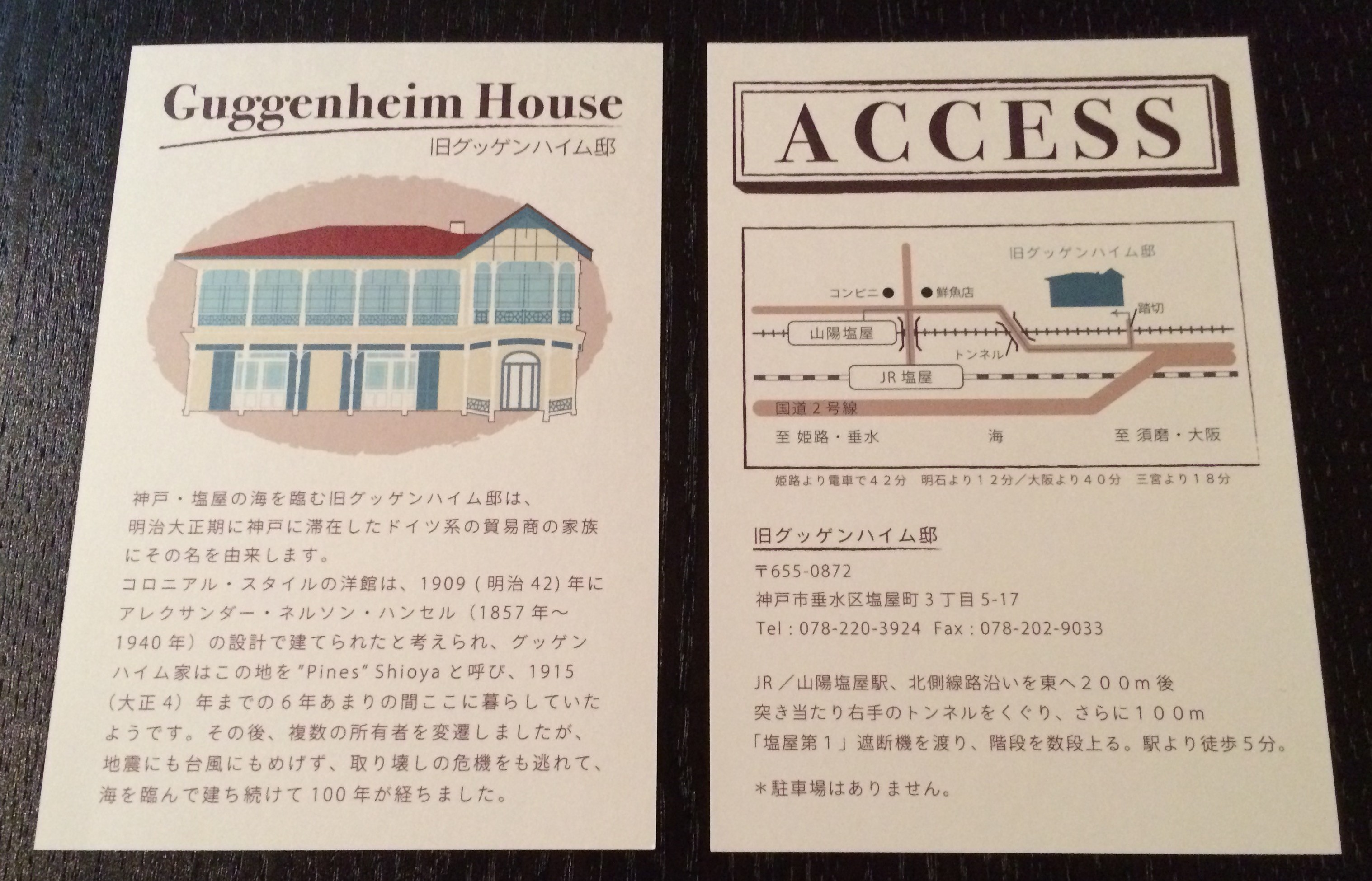
![[WEDDINGS] ILLUSTRATED ACCESS CARD](http://www.peacelovetokyo.com/home/wp-content/uploads/2015/07/IMG_6170-e1436466025778-323x400.jpg)
![[WEDDINGS] ILLUSTRATED ACCESS CARD](http://www.peacelovetokyo.com/home/wp-content/uploads/2015/07/IMG_6169-e1436465980888-286x400.jpg)
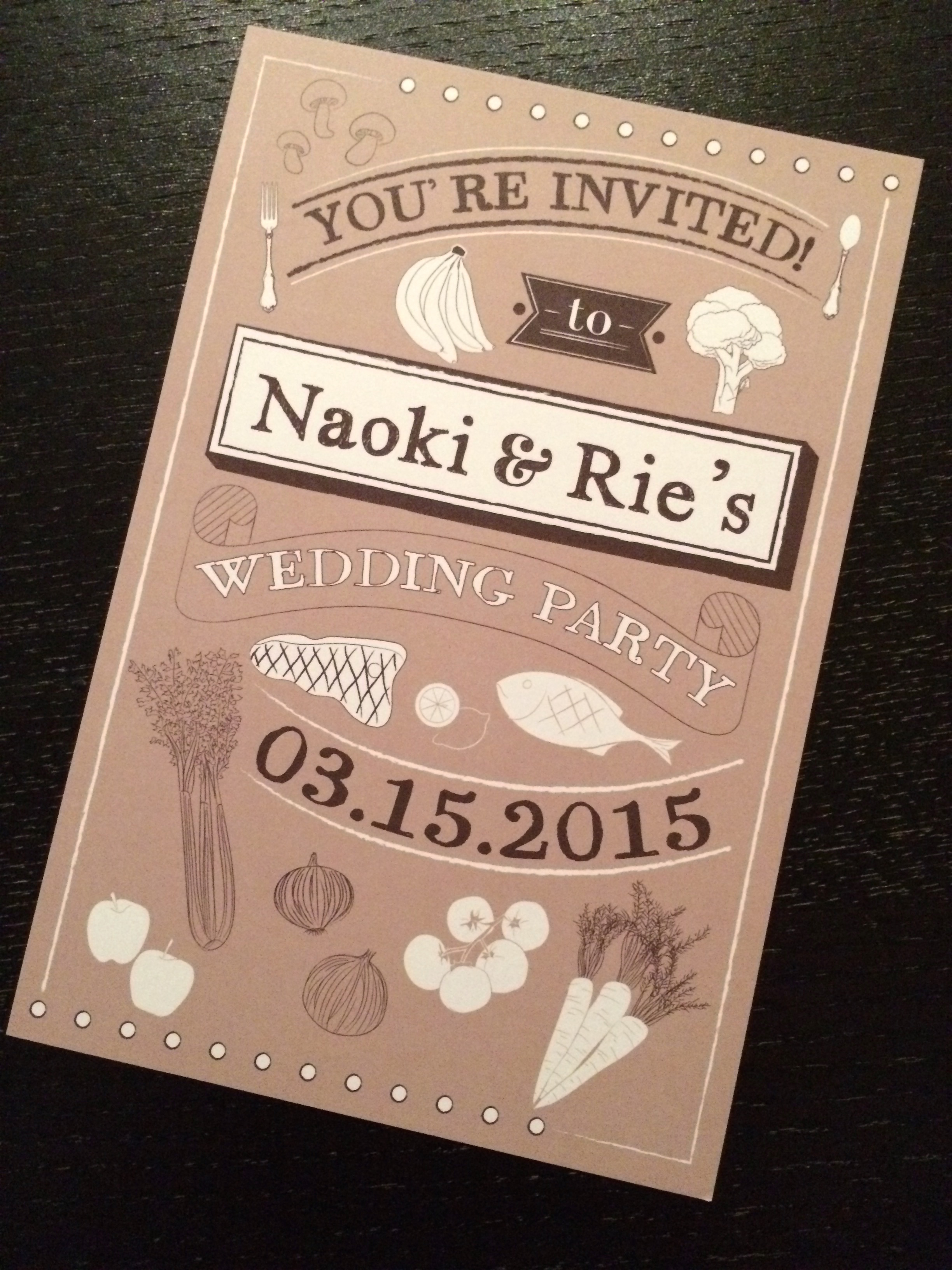
![[WEDDINGS] ILLUSTRATED INVITATION](http://www.peacelovetokyo.com/home/wp-content/uploads/2015/07/IMG_6062-400x300.jpg)
![[WEDDINGS] ILLUSTRATED INVITATION](http://www.peacelovetokyo.com/home/wp-content/uploads/2015/07/IMG_6065-300x400.jpg)