About m i n o r i

http://www.peacelovetokyo.com

Posts by m i n o r i:

[AVOCADO DYE] SCARF

avocado dye

months keep passing between my blog posts while life keeps going at light speed. like my previous post months ago, i’m playing catch up! it’s better late than never, right? >.<

投稿と投稿の間にあっという間に何ヶ月も経ってしまっています。知らないうちに時間が過ぎていて、前回の投稿と同じように、今回も1年弱前のプロジェクトをお見せします☆

during 2020, the year of COVID-19 quarantining, i had gotten so many projects done! this is one of them 🙂

昨年は、新型コロナウィルスの影響で長々とステイホーム生活が続いていましたね。その間に試してみた制作の1つを紹介します。

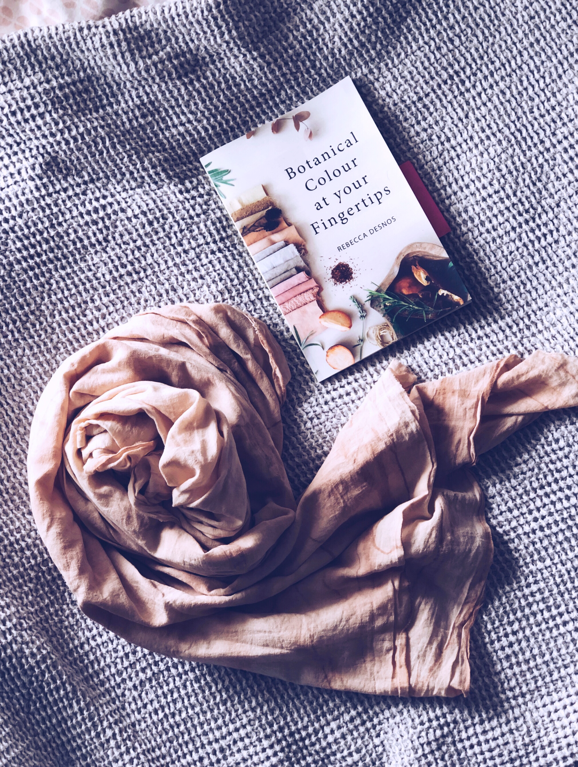
“Botanical Colour at your Fingertips” by Rebecca Desnos

for the longest time, i was curious about avocado dye.  i came across some posts and accounts that talked about natural dyes, which led me to finding this book, Botanical Colour at your Fingertips, by Rebecca Desnos.  it’s such a beautiful book with lots of pictures and step-by-step instructions.  i’m pretty much a beginner dyer (i did a little in fashion college), and the dye turned out very satisfactory.  before purchasing her book, i had read her blog post, when researching how to store avocado pits and skins, and to mordant (a method of prepping) the fabric.

以前からアボカド染色に興味を持っていました。SNSなどを通して、こちらの本に出会いました。アボカドのみならず、色んな種類の植物性染色方法が載っています。ほぼ初めての染色体験(服飾専門学校で少し勉強しましたが)でも、ステップ・バイ・ステップでたくさんの写真が載っていて分かりやすく進められました。元々は、染色するにあたってアボカドの保管方法と生地の媒染工程について調べている中で、この本の作者、リベッカ・デスノスが書くブログを見つけたのです。

overall, the process took a couple of months to complete: from mordant (a way to prep fabric to take dyes better), which is recommended to let sit for at least 1 week; extracting the dye, which takes a few hours on the stove and another 24 hours to let sit; and finally, dyeing the fabric, which you let sit another week after drying the dyed fabric.  every step of the way was so exciting to see the outcome and smelled delicious along the way (the soy milk i use has a very sweet and fresh scent).

全体で言うと、下準備から染色完了まで、全部で2ヶ月くらいかかりました。と言うのも、生地の先媒染(豆乳ベースの液体に浸け、乾いてから少なくとも1週間置く)、染料作り(半日ほど煮込み、24時間は置いておく)、そしてやっと実際の染め作業(乾いてからまた少なくとも1週間ほど)に入る。待つ時間が長いだけに、ずっとわくわくソワソワしていました。この間、無調製豆乳の香りが甘くて爽やかに漂っていました。

  1. setting the fabric in the soy milk mordant.  i believe the fabric is 100% cotton (but it was so long ago that i purchased it…), if not cotton, i’m pretty sure it is a natural fibre with the lighter test to prove.
    豆乳を使った完全植物性の先媒染液に生地を浸ける。生地は確か100%コットンだったと思うのですが、かなり前に購入していたので、覚えておらず。ただ、ライターテストをして自然の繊維はほぼ確かです。
    [AVOCADO DYE] SOY MILK MORDANT
  2. after setting the fabric overnight in the refrigerator (to prevent the milk from spoiling in the summer heat).  then let dry.
    repeat the soak and dry process 2 more times.
    i let the fabric sit in a paper bag (closed well) for about 1 month.  the paper bag kept the fabric dry, but prevented bugs (the soy milk smelled delicious, and if i could smell it…).
    媒染液に一晩浸けてから乾かす。
    この工程を後2度続け、最低1週間のところ、1ヶ月ほど紙袋の中で保管しました。紙袋であれば、通気性はよく、(豆乳の香りが漂っていたので)真夏でも虫が入ってこないかなーと思って、しっかり閉じました。
    [AVOCADO DYE] SOY MILK MORDANT
  3. to store the avocado pits and skins, i washed the flesh off really well and stored them in the freezer.
    アボカドの種と皮はしっかり果肉を取り除いてから冷凍庫で保存しました。
    [AVOCADO DYE] PITS AND SKINS
  4. adding water!  i bought an aluminum pot specifically to dye in, as the book recommends.  apparently, the aluminum helps as a mordant as well, without having to include aluminum in the dye itself.
    水を投入!アルミの鍋を染色用に購入しました。
    染色する際に、鍋のアルミも媒染力があるようです。
    植物性ではない染料には染料そのものにアルミなどの金属が媒染用に含まれていることがあり、多少人体に害があると本に記載されています。
    [AVOCADO DYE] PITS AND SKINS
  5. simmer and stir, simmer and stir, simmer and stir.  then, cool.
    じっくり煮込んで、混ぜ、煮込んで、混ぜ、そして冷ます。[AVOCADO DYE] SIMMERING
  6. after breaking apart the softened pits and skins, simmer and stir more.  then, cool again.
    柔らかくなってくるので、粗熱が抜けたアボカドを手袋をした手で崩す。
    その後、また煮込んでは混ぜ混ぜを続ける。そしてまた、冷ます。[AVOCADO DYE] SIMMERING
  7. the pits and skins have softened quite a bit and mash really well.
    だいぶ柔らかくなったので、粗熱が取れたらもっとしっかり崩す。
    [AVOCADO DYE] SIMMERING
  8. i simmered and stirred one more time.  after cooling, i strained them through a muslin cloth layered on top of a sieve.
    もう一回煮込んで混ぜてを続けて、いい感じに染料が抽出できました。
    こし器にシーチングをかけ、染料をこす。[AVOCADO DYE] STRAIN
  9. look at that mush!  the avocado pits contain lots of tannins which help to fix the dye.
    アボカドの種と皮がこのように!
    種の中にはよりよく染まるためのタンニンがたくさん含まれています。
    [AVOCADO DYE] STRAIN
  10. after letting the dye sit in the pot for 24 hours, the dye is complete.  then, in goes the fabric!
    染料を24時間、鍋のまま放置。染料の完成です!
    生地を投入!
    [AVOCADO DYE] DYEING

ta-da!  for a first time, i was looking forward to having a perfectly imperfect, organic finish.
出来上がり!初回はあえてムラのある仕上がり。

[AVOCADO DYE] SCARF

[AVOCADO DYE] SCARF

aside from this scarf, i have one more batch of dyed fabric to hopefully sew a sundress in the future!
このスカーフ以外に、いつかワンピースを作るための生地も染めました♡

[AVOCADO DYE] SCARF


[M & G WEDDING] MOTHER OF THE BRIDE

M & G is UnMe

last november, i had the honor of being a part of one of my best friends’ wedding; not only as a bridesmaid, but also to design their wedding stationery.

昨年の11月に、親友の結婚式でブライズメイドをしました。それに合わせて、結婚式当日のペーパーアイテムデザインも担当しました。

[M & G WEDDING] IL GASTRO SARA

the destination wedding was held in okinawa, at a gorgeous restaurant (il gastro sara) that features organic local ingredients and a breathtaking sunset.

沖縄で行ったデスティネーション・ウェディングのロケーションがまた素敵なレストラン (皿の上の自然)で、沖縄産の食材を使った絶品メニューと美しい夕焼けが最高でした。

[M & G WEDDING] PROGRAMS

the wedding colors were baby pink and baby blue. now, maya (the bride) is one of the most stylish people i know—her style is one that only she can pull off. so, it was super exciting to help execute the ideas she had in her mind.

デザインをするに当たって、ウェディングカラーとカップルの雰囲気を知った上で、ご要望に合わせたデザインを考えていきます。今回のカラーはベイビーピンクとベイビーブルー。新婦のマヤは、普段からスーパー個性的なファッションセンスを持っているので、彼女の創造を形にするお手伝いが出来て、凄くワクワクしました。

some key words to get the creative juices flowing were: sunset, ocean, “love & peace”, and the logo for their husband & wife hip-hop/r&b duo, UnMe. i started off with painting a watercolor background to use for print. i personally love using this method of scanning textured paintings or fabrics in high resolution to use for the background of a printed product. although i am a fan of uber simple, modern and minimalistic design, filling a background can instantly portray vibes, mood, and/or personality.

夕陽、海、彼女のモットー 『love & peace』、そして、二人が夫婦で組んでいるヒップホップ r&b コンビ UnMe のロゴを元にデザインスタート。テクスチャーのあるマーメイド紙に水彩画でいくつかのピンクと青のグラデーション背景を作り、スキャンして取り込みました。無地でミニマルなデザインも好きですが、このように高画質でテクスチャーのある紙や生地を背景にするのも一つの工夫です。

[M & G WEDDING] WATER COLORS
[M & G WEDDING] PARENTS OF THE GROOM
[M & G WEDDING] MOTHER OF THE BRIDE

[M & G WEDDING] MOTHER OF THE BRIDE

these paintings became the backgrounds for the food and drink menus, programs, mother and father of the bride and groom seating cards, and the thank you tags. for the font, we went with a soft gray to match the pink and blue. the logo seen on the program is the UnMe logo.

このように水彩画グラデーションがそれぞれのペーパーアイテムの背景となりました。フォントとUnMeロゴの色はグレージュにし、全面カラーでも洗練されたシンプルかつ個性的なデザインに仕上がりました。

aside from the stationery, i designed their welcome board. i had made one once before for my cousin, and it truly is a lasting piece of the couple’s wedding to have in their home together. since i don’t have the machinery to do the engraving myself, i go to a tokyu hands in tokyo, which has a wood shop and laser engraving service (they only engrave products purchased in store). first, i choose the slab of wood—organic edges give it a more natural feel—which i then take home to create a design within the board’s size (i double check with the engraving counter to make sure that they will allow me to take it home and bring back on a later day with a receipt). it does get pricey since the engraving fee depends on the total square area of the design (including the blank spaces). honestly, though, the finished board is just so beautiful for price to matter.

ペーパーアイテムとあわせて、結婚式当日の思い出として家に飾られるウェルカムボードをギフトとしてデザインしました。以前にいとこのウェディングギフトとしても贈ったことがありますが、ずっと残る世界に1つのアイテムになります。木材へのレーザー彫刻は、東急ハンズで(前回は池袋店でしたが、レーザー彫刻工房が終了し、こちらは渋谷店)注文しました。東急ハンズで購入した木材であれば、木材を持ち帰り、後日デザインデータと持ち込めば、注文ができます(店内購入商品であれば、木材に限らず色々なオリジナルアイテムを作成できます)。値段は少し張りますが、木材に刻まれたオリジナルデザインの完成品は感動物です!

[M & G WEDDING] WELCOME BOARD

2018 winter holiday handmade greeting cards

after a whirlwind of a year, christmas night is almost through, and the new year just ahead. this year’s holiday season greeting cards were a simple dedication to my tokyo life.

あっという間に過ぎ去った2018年、気がついたらクリスマスは終わりかけていて、年の瀬がすぐそこ。今年のクリスマスカードは、大好きな東京をテーマに、シンプルに仕上げました。

m a r u n o u c h i ,  t o k y  o  |  j a n u a r y  2 0 1 8

the inspiration came from this photo i took in marunouchi, this past january. which reminds me of when i lived in wall street, nyc.
1月に撮った東京駅、丸の内の写真。学生時代に住んでいたニューヨークのウォール街を思い出させるこのショットが2018年を通して、一番お気に入りだったのです。

. . . . .

handcut tree window
ツリー型の切抜き

gold and white spray paint

…from tokyo…

H A P P Y  H O L I D A Y S ! !

[fashion trend study] S/S 2009

it’s been almost A YEAR since my last fashion trend study (*gasp*)!! i have a whole stack of old magazines pages, waiting to be collaged and studied! today, is about 2009 spring/summer.
前回のトレンドスタディーからもう一年も経ってしまいます(大変大変(汗))!!何ページもの切り出しがたまっていて、また続けていこうと思います!今日は、2009春夏トレンドについてです。

[ S/S 2009 ]

– what happened in 2009 / 2009年のファッション出来事 –
michelle obama and the one-shoulder dress / ミシェル・オバマとワンショルダー・ドレス
yellows & golds / 黄色とゴールド
exotic bohemian cont’d / 前シーズンから引き続きエキゾチックボヘミアン
dresses / ワンピース
color blocking / カラーブロック
shoulder accents / アクセントショルダー
pops of color / カラー・ポップ
big accessories / デカめアクセサリー
geometric folds & pleats / 幾何学プリーツ
harem & skinny ankle pants / ハーレムパンツ & 足首細めパンツ
old school denim (dyed & damaged) / レトロなデニムディテール (クラッシュや染めなど)
watercolor florals / 水彩画フローラル
bows / リボン

one of the biggest trends of 2009 spring/summer, was the one-shoulder dress. a major highlight would be then first lady, michelle obama’s inauguration ball dress, designed by jason wu. also, dresses became a staple in the wardrobe, layering them over leggings, pants, or on their own–in a sense, an expression of the continued bohemian trend from the winter. i have a lasting impression of origami folded details in skirts and dresses. and my number one favorite, that i still consider a staple of my own, is the harem/carrot top pant with skinny ankles.

2009年春夏で印象的なトレンドはワンショルダーのドレス。特に、米大統領就任式後の舞踏会にミシェル・オバマ大統領夫人が着用したジェーソン・ウーのドレスが代表的でした。2009年はたくさんのスタイルのワンピースが出まして、チュニック代わりにレギンスやパンツとのレイヤリングが多く見られました。それも、冬から続いたボヘミアン・トレンドの表れかもしれません。それ以外では、幾何学的おりがみプリーツも未だに覚えています。個人的には、ハーレム・パンツとの出会いがこの年かもしれません。今でも私の中ではハーレム・パンツは常にある存在です♡(笑)

(left to right):
one shoulder
geometric pleats + watercolor floral
bohemian / tribal layers + tiered dress + retro denim harem pants
shoulder accents + exotic brooches + tunic + carrot top pants
bold & bright pops of color + bulky accessories

happy 2018!

2017 did me well. it was a rough year, but a much needed time to realize what i am capable of and what is pushing it.
昨年は、心身共にハードな1年でした。でも、そのおかげで自身の可能性もリミットも知るきっかけになりました。

now it’s 2018 and i am ready to take on all the artwork my mind can produce! simply put, my resolution is to J U S T  C R E A T E.
2018年になって、全身全霊、想像力を発揮する準備万端です。
今年の抱負は、『作る』。とにかく作る、ひたすら作る

what are your goals for the coming year?
皆さまは、今年の目標は考えられていますか?

whatever they are, follow your heart, your soul, and believe in yourself, trust your instincts. may you all have a fulfilling year for both body and mind.
何があっても、心を、自身を、勘を信じて進めば大丈夫。
皆さまにとって、精神的に、身体的に、健康な一年になりますように。

H A P P Y  N E W  Y E A R ! !

p.s. the main photo of this post is of my nengajou for this year! all lettering and graphics by me. (still practicing chalkboard lettering in 2nd photo!)
メインフォトは、今年の年賀状。今年もグラフィックとレタリングデザイン頑張りました!(2枚目のチョークボードアート、頑張っています!)

handmade greeting cards for 2017 holiday season!

december is already halfway through! the past couple months has flown by faster than light years! exaggerating? yes, but really… i still had to squeeze in this batch of handmade holiday cards for friends and fam. once an idea comes to mind, i just must. do. it. here, i share the process!

もう12月が半分過ぎてしまい、この数カ月が猛スピードで過ぎ去ってしまいました。でも、どうしても作りたいクリスマスカードのアイデアを思いついてしまい、作っちゃいました!今回は、親戚や友人宛なので販売しませんが、特別にプロセスお見せしちゃいます☆

. . . . .

i started off by creating the layout on adobe illustrator
パソコンでレイアウトを作る

handcut letters
文字の切抜きはすべてハンドカット

these transparent origami sheets are from daiso.  i’ve been waiting for the perfect opportunity to use them! instead of using traditional christmas colors, i wanted to go with a “holiday neutral” color scheme. a bit of 90’s and a bit of neon and every bit pop!
以前にダイソーで一目惚れした透明のおりがみ。使う機会を待っていました〜!海外の友人でクリスマスを祝わない方もいらっしゃるので、あえて赤とグリーンにこだわらないカラーテーマを考えました。90年代風なネオン&ポップになりました!

after covering the backside of the transparent sheets, i wrote in the “holidays”. i’ve been practicing my lettering, and these are the perfect opportunities to put them to use!
friends and family won’t judge 😉
おりがみの裏面をカバーし、手書きで 『holidays』 を入れました。最近レタリングに力を入れていて、家族や友人に贈るカードであれば、プレッシャーなく実践できます ^_^;

i switched the string to this glitter thread i found at another 100yen shop!
最後の最後に、キャンドゥーで見つけたラメ入り糸を見つけたので、こちらに変更!

v o i l a !

H A P P Y  H O L I D A Y S ! !

kamari

kamari city is where acropole sunrise (my hotel) was located. it is probably most known for the black “sand” (more like pebble) beach. there is walkable access to the ancient thera ruins if you are willing to hike; if not, there is a bus that goes there (the bus stop is near the beach). it is a quaint city, with a bus that leads to fira which is the main bus hub to go to all the tourist spots on thira island. since i went in the very beginning of the season, it was too chilly for the beach and many of the beach side hotels were closed. in peak season i can imagine it must be very lively. many locals live in this town with an elementary school, two supermarkets, a bakery, a souvlaki stand, and some restaurants scattered about, it is a very comfortable city to stay.

宿泊先のアクロポール・サンライズはカマリ市にあります。カマリの名所は黒い砂(どちらかというと黒い小石)のビーチ。古代ティラの遺跡も歩ける距離ですが、ハードなハイキングが厳しければカマリ・ビーチ近くのバスからもアクセスできます。私が行ったのはシーズン始めだったので、海水浴には寒く、閉まっているホテルがほとんどでした。ピーク時はビーチ付近にホテルやバー・レストランが多いので賑わっているかもしれませんが、住宅街や小学校がある静かな町です。ティラ島の中心部でメインの観光地のフィラまでバスで一本。その他の観光地はフィラで乗り換えられます。スーパーが2箇所、パン屋さん、スブラキ・スタンド(ギリシャを代表するファースト・フード、日本で言えばたこ焼き屋さんみたいな手軽さ)、たくさんのレストランなど、とても居心地の良いカマリでした。

in 1957 there was a big earthquake in santorini. petros’ (acropole sunrise’s owner) father’s house included, the original town of kamari was destroyed. it happened at 10:00-11:00 am, so most people were out of their homes and in the fields. unfortunately, many mothers with little babies that had been staying inside had passed away. the current town of kamari is the new one.

1957年、サントリーニで大きな地震がありました。アクロポール・サンライズのオーナーのペトロスから聞いた話ですが、彼の父親の家を含め、元のカマリ市は破壊されました。午前10時〜11時頃に起きたので、ほとんどの人は外出していました。ですが、乳幼児の面倒を見る母親たちとお子さんたちの多くは亡くなりました。その後、別の場所で再建されたのが現在のカマリです。

there’s something significant about getting to hear first-hand, the stories of a precious island so rich in history (geologically and religiously/archaeologically). this current thira is relatively new, a work in progress, living amongst ruins, constant work to create more and more hotels. however, the truth is that they live in a dormant volcanic area (not due to erupt anytime soon–probably not in this lifetime), but the last eruption wasn’t too long ago and earthquakes happen. it’s a recently modernized island–wifi is still new and electricity comes by way of underwater pipeline. it will be interesting to see how it changes in the near future.

この小さな島が経験してきた様々な歴史(地質的にも、宗教的にも、考古学的にも)の話を直接現地の方々から聞けることは貴重な体験だと感じました。現在のティラ島は、なぜか若く感じます。地震や火山に破壊された地、廃墟とともに暮らし再生を試みている人々。その再生への道に、観光業界という希望の光があったのか、たくさんのホテルが建てられている。現実を見ればサントリーニ・カルデラは休火山で、近年中に噴火する気配はなさそうですが、前回の噴火を経験した人はいて、地震も起きています。wi-fiが入ったのもごく最近で、電気は海底ケーブルを通してギリシャ本土?から来ています。そんなサントリーニ、ティラ島はどのように変わっていくのでしょうか?

. . . . .

– P I C T U R E S Q U E  H O T E L S –
– 絵 に な る ホ テ ル –

– K A M A R I  B E A C H –
– カ マ リ ビ ー チ –

KAMARI BEACH

KAMARI

KAMARI BLACK SAND

– L O C A L  L I F E –
– ロ ー カ ル ラ イ フ –

the supermarket (this one was slightly cheaper than the one near the beach). i bought greek olive oil, soap, and honey for souvenirs here!
スーパー (ビーチ近くのスーパーより全体的に金額が安かったです)。ここでお土産用のギリシャ産オリーブオイルやオリーブオイル石鹸、ハチミツなど購入しました。

– M O N A S T E R I E S –
– 修 道 院 –

– H O U S E S –
– 民 家 –

– D O N K E Y  S T A B L E S –
– ロ バ 小 屋 –

i saw these on the first day, rows of white long houses across the street from the slovakis/gyros stand. being a fanatic of color, the rainbow colored windows caught my eye. i asked petros and apparently they’re donkey stables. the local donkey parking lot! until just 30-40 years ago, each household owned a donkey. back then, not many people owned cars. now there are many small hatchbacks or mopeds driving around (much smaller in comparison to the massive american SUV’s or even the compact sedans and kei-cars of tokyo).

初日に行ったスブラキ・スタンドの向かいに見かけた横長に繋がった建物。小さな窓は赤・黄・緑・青の原色に塗られていました。でも、ドアも人の気配もないので、何の建物なのか気になりました。ペトロスに聞いたら、30〜40年前にロバ小屋として使用されていたようです。その頃、各家庭に車ではなく、ロバが飼われていたので、公共のロバ駐車場でした。今は、日本の軽自動車に比べても小さな車や原付バイクがほとんどです。

– W H I T E  T R E E S –
– 白 く 塗 ら れ た 木 々 –

i’m so curious as to what the white paint is for!
謎の白い木々!

– T H E  S O U V L A K I  S T A N D –
– ス ブ ラ キ ・ ス タ ン ド –

i was here practically every day! for lunch on the days in and for dinner after all the hiking and touring. the chairs matched the color of the donkey stable windows! i see a lot of these primary colors around santorini, like the flower pots i saw in fira.

観光していない日の昼食や一日出かけていた日の夕飯にと、ほぼ毎日立ち寄っていたスブラキ・スタンド。ギリシャ名物のスブラキは、一口大に切った肉や野菜などの串刺し料理です。ポテトフライや野菜とともにピタサンドに包まれて出されました。店内の椅子は、ロバ小屋と同じ原色。フィラで見た植木鉢も同じ色でした。

– C I N E M A –
– 映 画 館 –

on the third day, i decided to go see the fate of the furious (international movies in japan show much later, so i figured why not see it early?) at the cinema in kamari. kamari has a famous drive-inn theater, but it was much too cold for that. unfortunately, since the subtitles were in greek, i had no idea what was being spoken in the foreign language scenes…

三日目の夜、大好きなワイルド・スピードシリーズの最新作を観にカマリの映画館へ行きました!夏場であれば有名なドライブインシアターもあるみたいなのですが、シーズン前でまだ開いていませんでした。残念ながら、字幕がギリシャ語だったので、外国語部分は全然分かりませんでした…