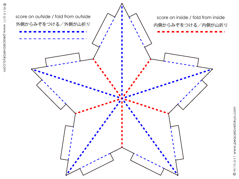
weddings / ウェディング

[M & G WEDDING] MOTHER OF THE BRIDE

M & G is UnMe

last november, i had the honor of being a part of one of my best friends’ wedding; not only as a bridesmaid, but also to design their wedding stationery.

昨年の11月に、親友の結婚式でブライズメイドをしました。それに合わせて、結婚式当日のペーパーアイテムデザインも担当しました。

[M & G WEDDING] IL GASTRO SARA

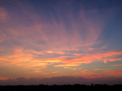
the destination wedding was held in okinawa, at a gorgeous restaurant (il gastro sara) that features organic local ingredients and a breathtaking sunset.

沖縄で行ったデスティネーション・ウェディングのロケーションがまた素敵なレストラン (皿の上の自然)で、沖縄産の食材を使った絶品メニューと美しい夕焼けが最高でした。

[M & G WEDDING] PROGRAMS

the wedding colors were baby pink and baby blue. now, maya (the bride) is one of the most stylish people i know—her style is one that only she can pull off. so, it was super exciting to help execute the ideas she had in her mind.

デザインをするに当たって、ウェディングカラーとカップルの雰囲気を知った上で、ご要望に合わせたデザインを考えていきます。今回のカラーはベイビーピンクとベイビーブルー。新婦のマヤは、普段からスーパー個性的なファッションセンスを持っているので、彼女の創造を形にするお手伝いが出来て、凄くワクワクしました。

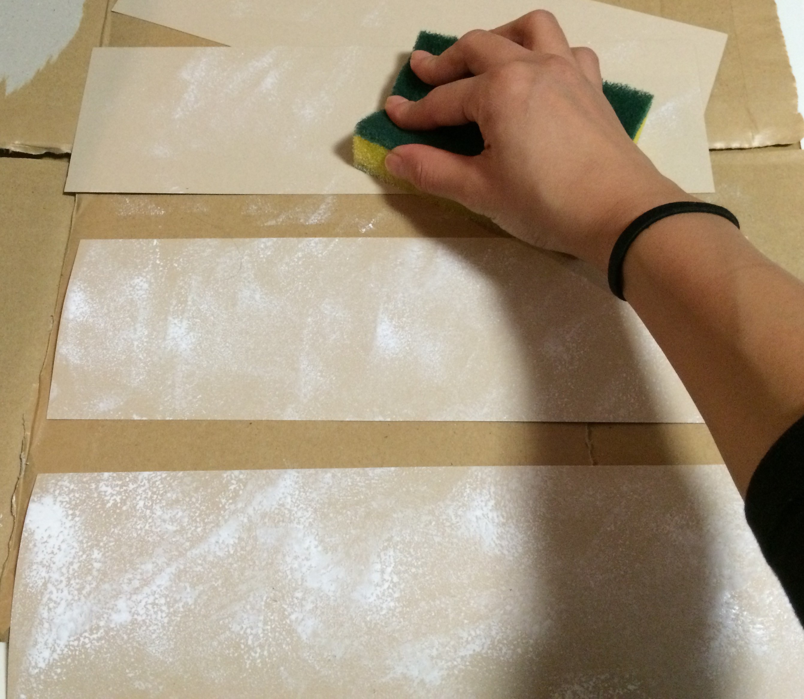
some key words to get the creative juices flowing were: sunset, ocean, “love & peace”, and the logo for their husband & wife hip-hop/r&b duo, UnMe. i started off with painting a watercolor background to use for print. i personally love using this method of scanning textured paintings or fabrics in high resolution to use for the background of a printed product. although i am a fan of uber simple, modern and minimalistic design, filling a background can instantly portray vibes, mood, and/or personality.

夕陽、海、彼女のモットー 『love & peace』、そして、二人が夫婦で組んでいるヒップホップ r&b コンビ UnMe のロゴを元にデザインスタート。テクスチャーのあるマーメイド紙に水彩画でいくつかのピンクと青のグラデーション背景を作り、スキャンして取り込みました。無地でミニマルなデザインも好きですが、このように高画質でテクスチャーのある紙や生地を背景にするのも一つの工夫です。

[M & G WEDDING] WATER COLORS
[M & G WEDDING] PARENTS OF THE GROOM
[M & G WEDDING] MOTHER OF THE BRIDE

[M & G WEDDING] MOTHER OF THE BRIDE

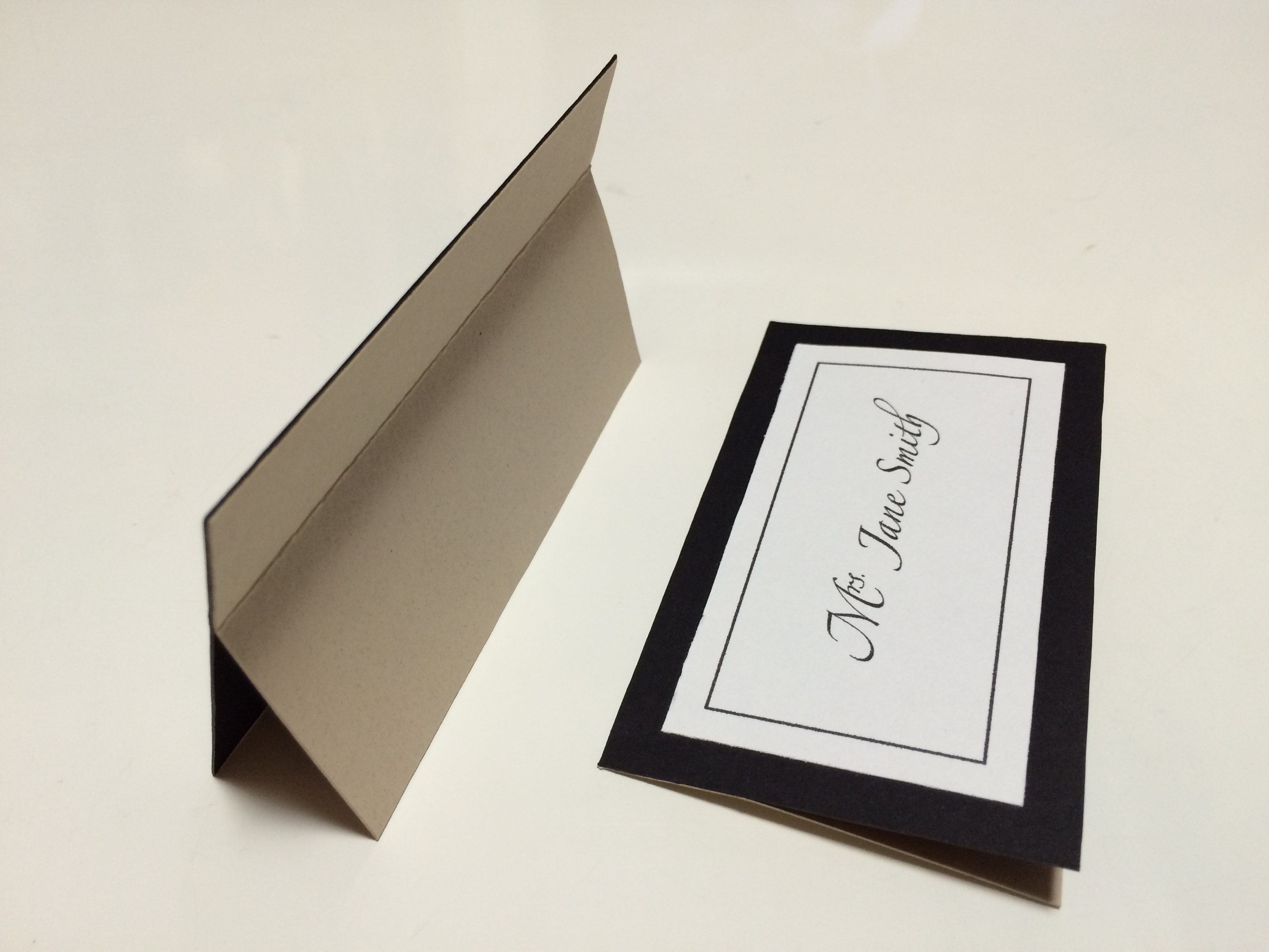
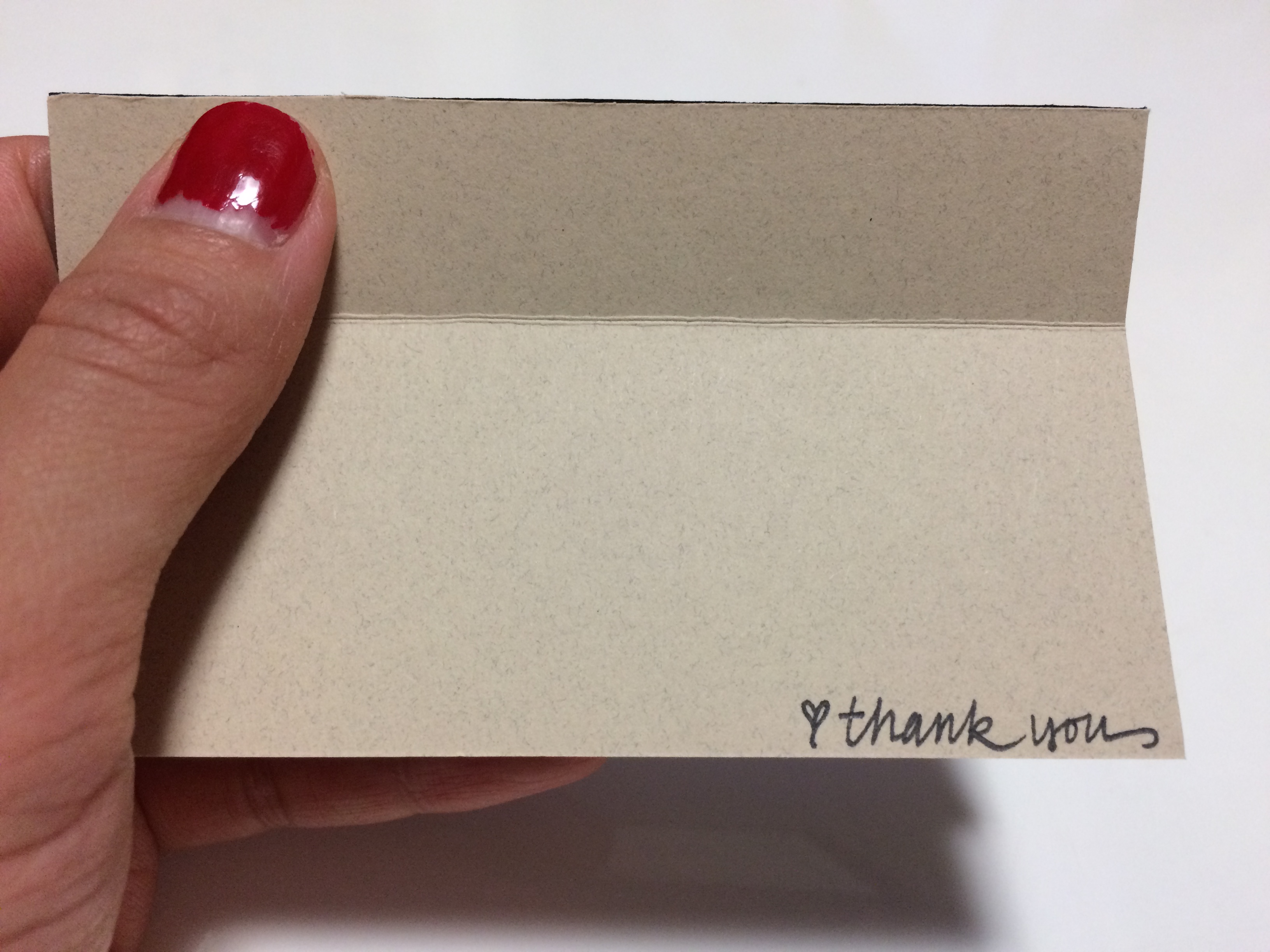
these paintings became the backgrounds for the food and drink menus, programs, mother and father of the bride and groom seating cards, and the thank you tags. for the font, we went with a soft gray to match the pink and blue. the logo seen on the program is the UnMe logo.

このように水彩画グラデーションがそれぞれのペーパーアイテムの背景となりました。フォントとUnMeロゴの色はグレージュにし、全面カラーでも洗練されたシンプルかつ個性的なデザインに仕上がりました。

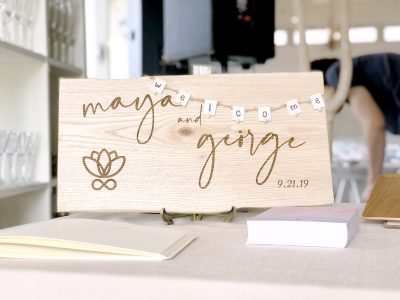
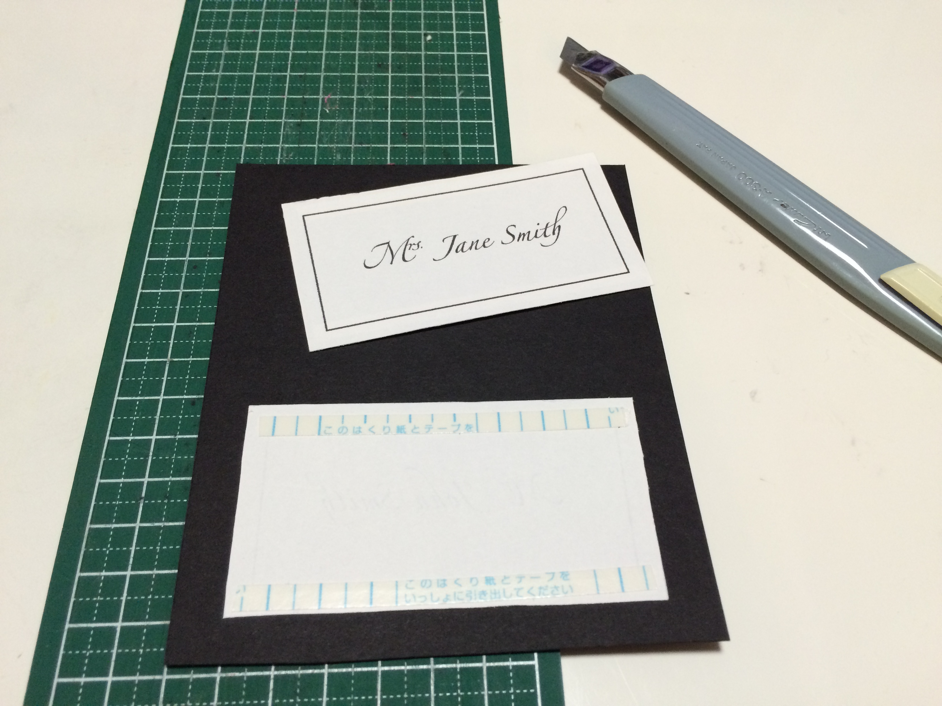
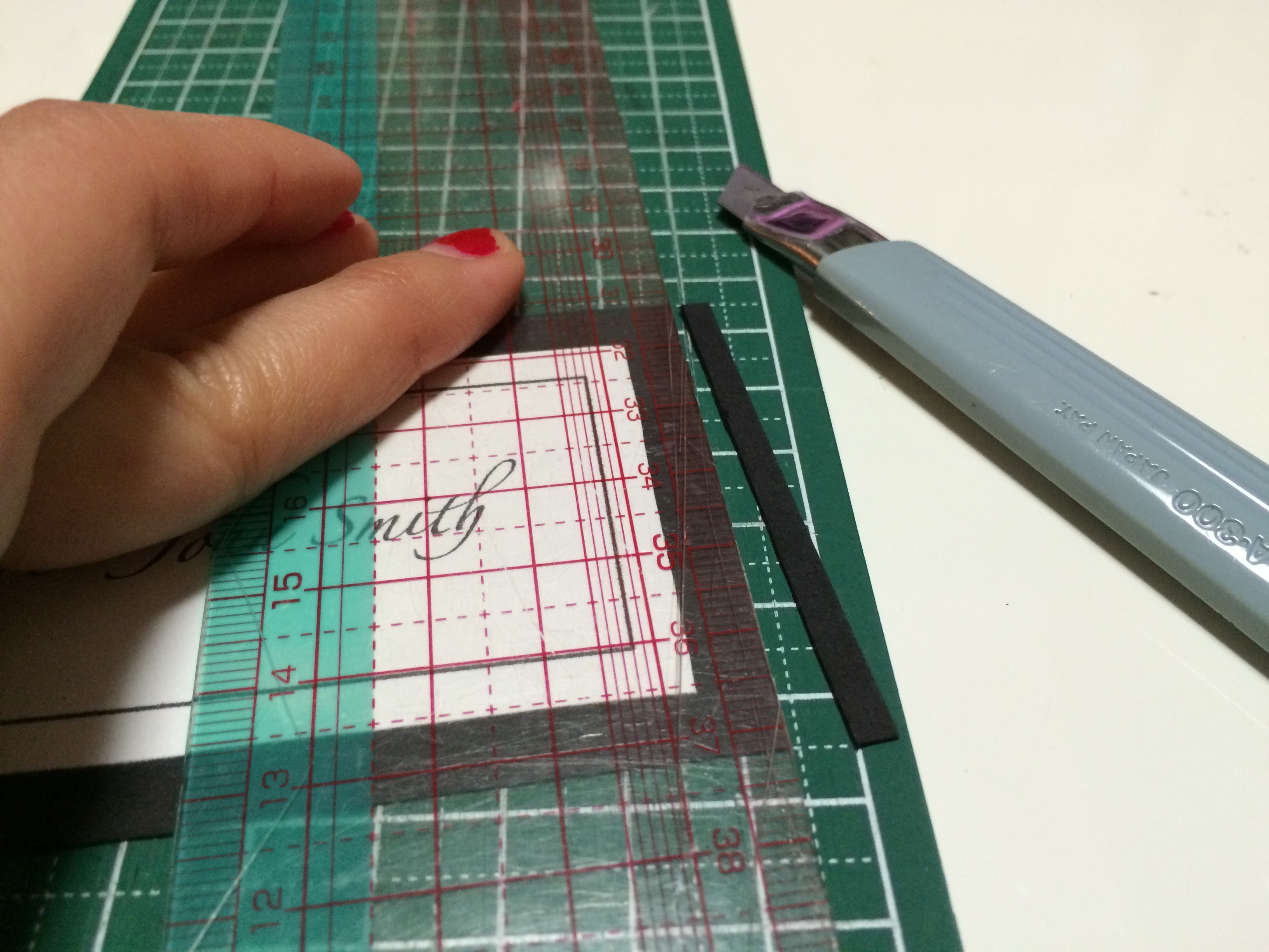
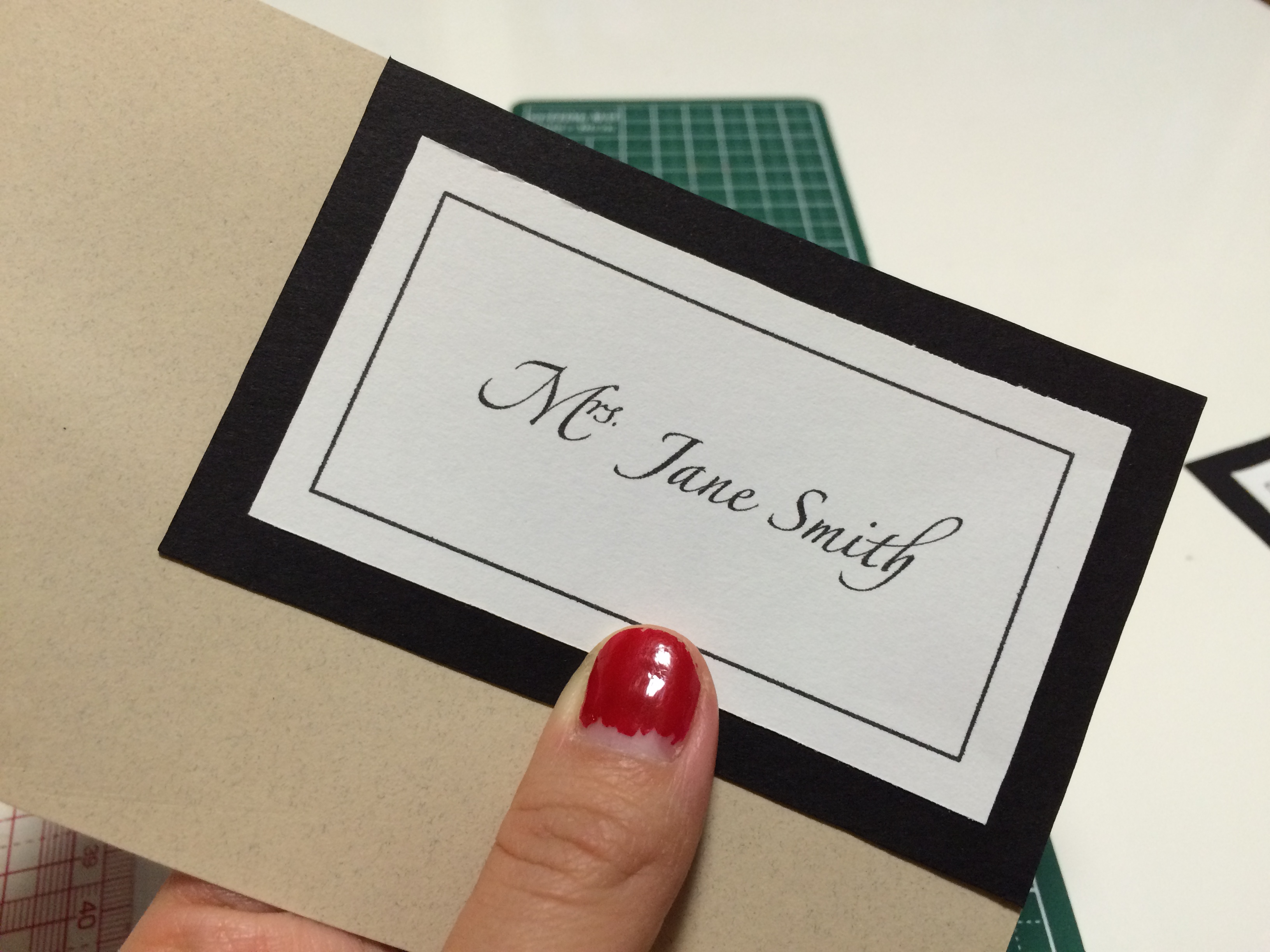
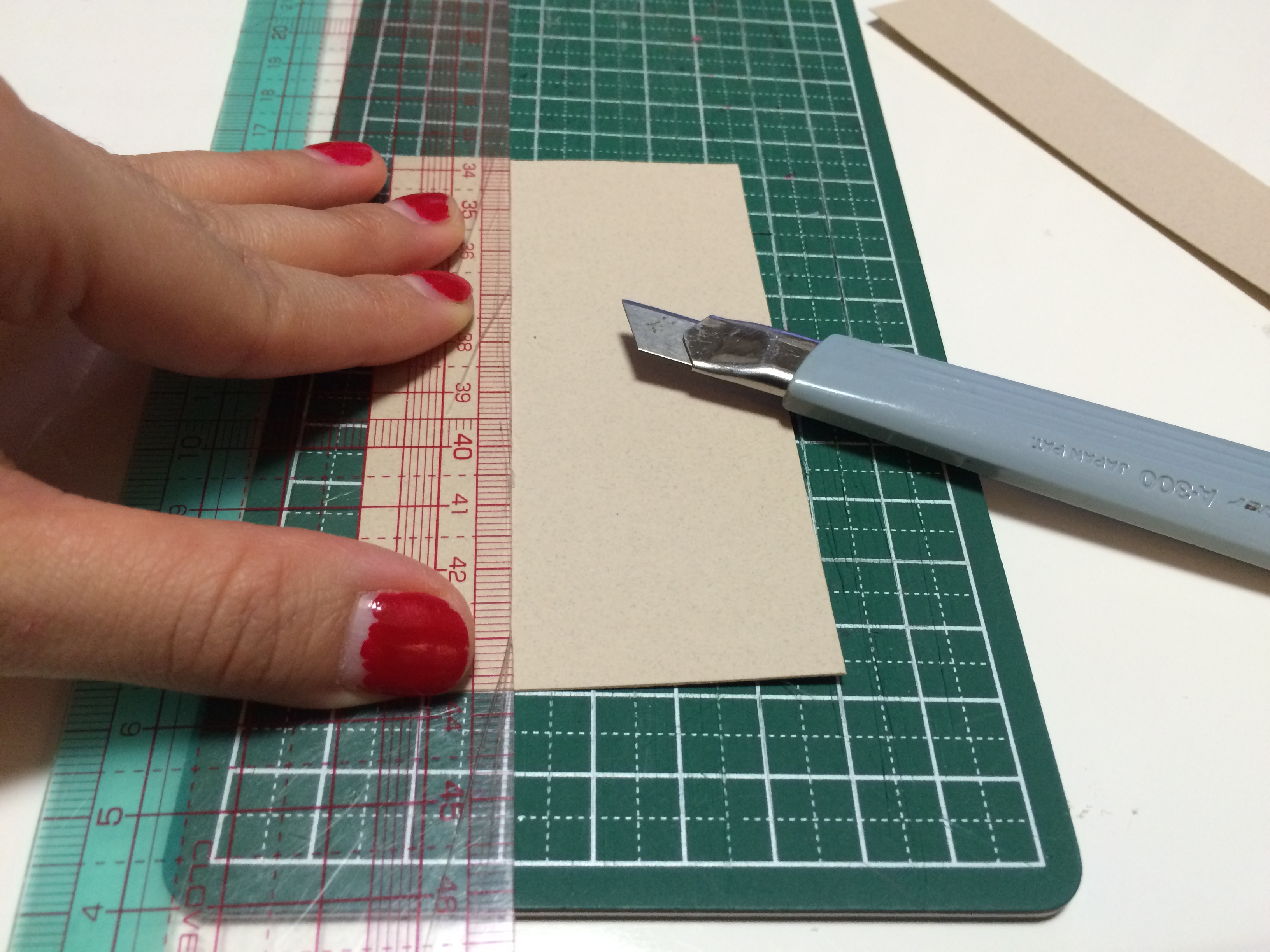
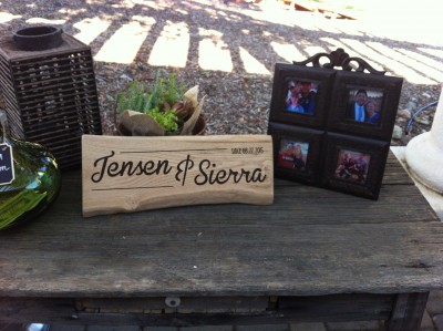
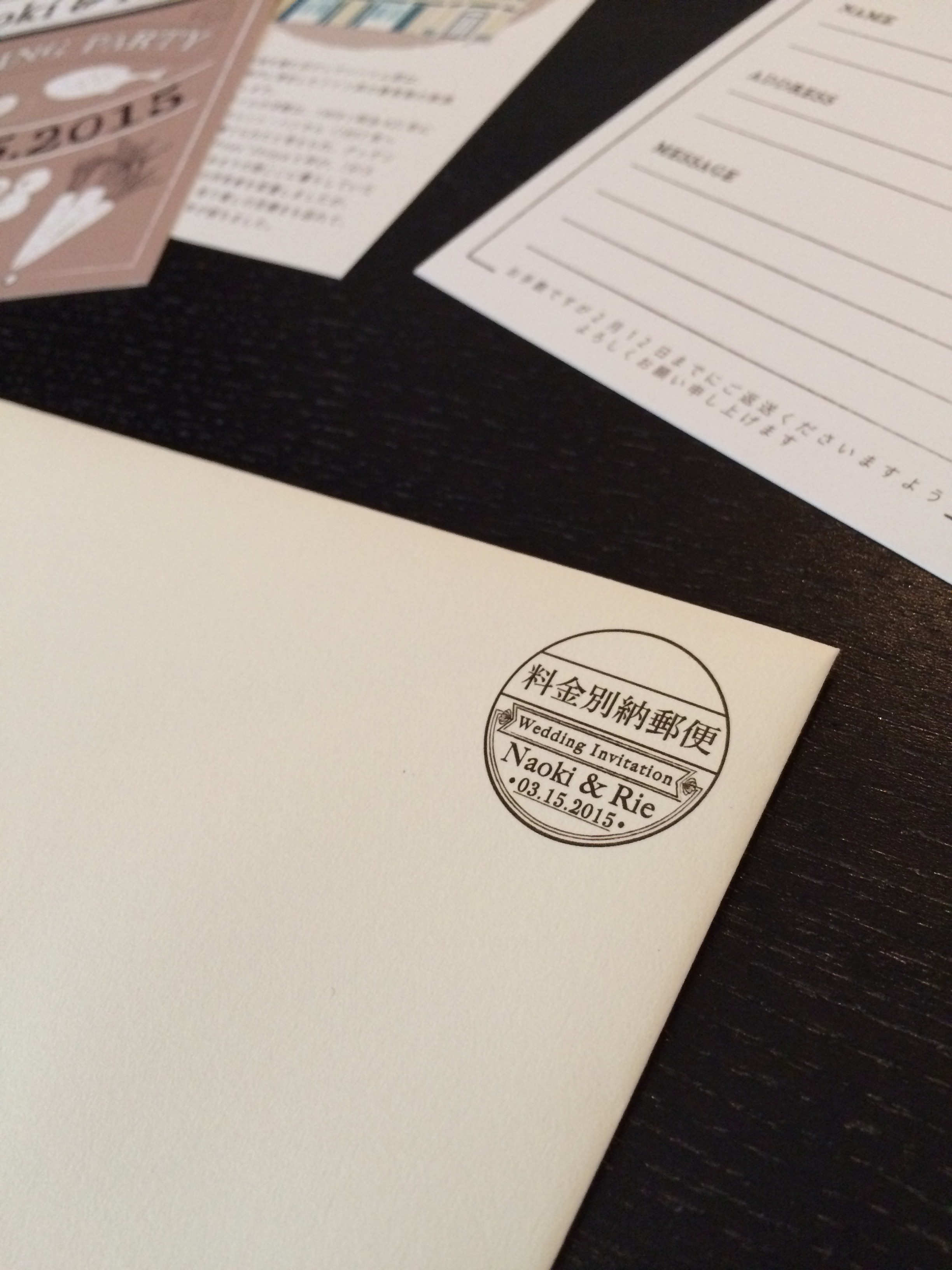
aside from the stationery, i designed their welcome board. i had made one once before for my cousin, and it truly is a lasting piece of the couple’s wedding to have in their home together. since i don’t have the machinery to do the engraving myself, i go to a tokyu hands in tokyo, which has a wood shop and laser engraving service (they only engrave products purchased in store). first, i choose the slab of wood—organic edges give it a more natural feel—which i then take home to create a design within the board’s size (i double check with the engraving counter to make sure that they will allow me to take it home and bring back on a later day with a receipt). it does get pricey since the engraving fee depends on the total square area of the design (including the blank spaces). honestly, though, the finished board is just so beautiful for price to matter.

ペーパーアイテムとあわせて、結婚式当日の思い出として家に飾られるウェルカムボードをギフトとしてデザインしました。以前にいとこのウェディングギフトとしても贈ったことがありますが、ずっと残る世界に1つのアイテムになります。木材へのレーザー彫刻は、東急ハンズで(前回は池袋店でしたが、レーザー彫刻工房が終了し、こちらは渋谷店)注文しました。東急ハンズで購入した木材であれば、木材を持ち帰り、後日デザインデータと持ち込めば、注文ができます(店内購入商品であれば、木材に限らず色々なオリジナルアイテムを作成できます)。値段は少し張りますが、木材に刻まれたオリジナルデザインの完成品は感動物です!

[M & G WEDDING] WELCOME BOARD

finished

[d.i.y.] super easy name placements

you’ve hit wedding crunch time and your guest list is finally finalizing. of course, this has to be at the last minute. if you can find a calligrapher at the last minute, that’s great, but you just don’t want to think about it and want to use the ol’ computer and printer for name placements. however, you still want your name placements to look great! here’s a d.i.y. for you!! (if your guest list is mostly finalized and you want to check this off your list earlier on, it doesn’t hurt to make some name placements for the “maybe”‘s and a few blank ones for last minute “i can make it!”‘s.)
結婚式の準備のラストスパート!ゲストリストが確定してやっと始められる準備の一つが席札。印刷会社に頼むのも時間とお金がかかるし、できればご家庭のパソコンとプリンターで済ませたいところ。もちろん、見た目もちゃんとしたいし・・・そこでこのDIYがオススメです!(ゲストリストがある程度確定していれば、お返事をいただいていないゲストの分も多めに作って早めにこの作業を終わらせる手もあります。また、念のため、何も書かれていない席札を多めに作っておくのもオススメです。)

LET’S START! / 始めよう!

the goods

what you need / 材料:
card stock (optional: 2 types for front and back) / 厚紙または画用紙 (オプションとして表と裏で別々の紙を2種類)
printed names / 印刷されたネーム
cutting board / カッティングボード
cutter / カッター
(if available, a paper cutter will speed things up! pre-cut the names and card stock to size before hand (see below steps for sizes. front and back are the same size). / ペーパーカッターがあれば早いです!前もってネームと厚紙を人数分切り出しておくと、なお効率いいです。下記ステップに各サイズを表記しています。厚紙は、表裏共に同じサイズです。)
ruler / 定規
(i used a transparent sewing/patterning ruler (see step 1) to measure and cut simultaneously. / 透明のパターン用定規(ステップ1をご参照ください)を使うと測りながら切ることが出来て、スピードアップ出来ます。)
double stick tape / 両面テープ

cut out  names
1. cut out the names to 8.7cm x 4.7cm/3 1/2in x 1 3/4in (i cut 5mm/1/8in around the rectangle using my patterning ruler). / 印刷されたネームを8.7cm×4.7cmに切る。(透明の定規を使って長方形の周り5mmでカットしました。)

double stick names
2. apply double stick tape to the backs of the names and apply to the center of the front card. / 両面テープをネームの裏に貼り、表になる厚紙の中心に貼る。

cut out card
3. cut out the front card to 10cm x 6cm/4in x 2 3/8in (here i cut 7mm/1/4in around the name paper using the patterning ruler). / 表カードを10cm×6cmに切る。(透明定規を使用してネームの周囲7mmでカットしました。)

cut out backing
4. match the front card to a corner of the back card, and cut to the same size. / 裏紙の角に表カードを合わせ、表カードのサイズに合わせて切る。

score backing
5. with a cutter, lightly score the back card 2cm/3/4in inside one of the longer sides. / カッターを使用して、裏カードを長い辺から2cm内側に軽〜く切り込みを入れる。

close up of score
here’s a close up of the score. / 切り込みのアップ。これくらい軽くでいいのです!

fold score
6. LIGHTLY fold score, with the cut side on the inside. / 優しく折り目を作る。切った面が内側の谷面になります。

double stick backing
7. apply double stick tape to the thinner side of the score, again with the cut side facing down. / 山面になる側の細い部分に両面テープを貼る。

attach backing to card
8. attach the backing to the front card, making sure that the name card is facing right-side up, and aligning the taped end to the top back side of the name card. / 裏カードを表カードと合体する。その際に、表カードのネーム面を手前に向け、裏カードのテープ面が表カードの裏の上端に合わさるように貼ります。

finished
FINISHED! / 出来上がり!

it's flat!
this name card is great because it is easily flattened to lessen the load to take to your wedding reception! / この席札は、平にしやすい上、最低限の場所をとるので披露宴の荷物を詰めやすくします!

[side note / ちなみに]
regarding my printer & paper for d.i.y. wedding paper items
d.i.y.ウェディングペーパーアイテムで使用しているプリンターと紙について

printer & paper
| my printerプリンター |
CANON PIXUS MG7530

an amazing purchase!! it prints both fine or fast, adjusts to many paper types, can print via wifi and from smart phones, and the quality is just great! for weddings, it’s best to print with a “fine printing” setting. it will look absolutely professional! / 重宝しています!ファインとスピーディで印刷設定を変えられ、様々な紙面に印刷できる上、wifiでスマホからも印刷できます。そして、何よりもクオリティが最高です!結婚式のためでしたら、ファイン設定がオススメです。

| aravealアラベール |
MY FAVORITE. i recommend it to all my customers for it’s supple texture and matte look. since i take orders for making name placements, i have my own batch that i order from this online shop and my computer prints perfectly on it. / お客様にいつもオススメしている紙です。表面の凹凸がさりげなく、なめらかでマットに仕上がります。席札のご注文をいただいているので、takeopaperさんから発注して常備しています。自宅のプリンターでも綺麗に印刷されます。

thank you

completed closeup

[d.i.y.] starry night card stock garland

right smack dab in the middle of the holiday season, bustling around for presents, preparing the house for the freezing winter months and the streams of expected guests, i of course had to think up another diy decoration project (well it was more because i had come across these dreamy fairy lights that i’ve been looking for all year) and thanks to my overly ambitious creative mind, i always lose a lot of sleep … but the results are worth it.

クリスマスシーズン真っ只中の今、家族のプレゼント探しから、大掃除、クリスマスパーティの準備などなど、やる事が途絶えない師走のこの時期に、新しいDIYを思いついてしまいました。実を言うと、インスピレーション源は一年中探していたフェアリーライトを niko and… で見つけた事です。睡眠時間削ってでもどうしても作りたかったスターガーランドが完成しました。

LET’S START! / 始めよう!
*sample uses 5 sheets for 30 stars / サンプルは5枚=星30個使っています

what you need / 材料:
1 A4 size card stock (for 6 stars) / A4サイズ厚紙や画用紙1枚(星6枚)
white acrylic paint / 白いアクリル絵の具
sponge for painting / スポンジ
gold spray paint / ゴールドスプレーカラー
printed template (1 sheet=6 stars) / 型紙のプリント(1枚=星6個)
CLICK HERE FOR FREE TEMPLATE / 無料型紙は、こちらをクリック
all purpose glue / 糊
scissors / ハサミ
needle or pointed tool / 目打ち
ruler / 定規
cutter / カッター
cord / 紙紐
tape / テープ

paint card stock
1. use a sponge to paint card stock. this adds a marble-type of effect for the first layer! then spray a thin layer of gold paint. (i used strips of leftover cardstock.) / スポンジでアクリルペイントを厚紙に叩くように塗る。マーブル調になります。次にゴールドのスプレーカラーを薄く塗る。(私は余り物の厚紙を使用しているので紙サイズが異なります。)

finished card stock
2. after at least 24 hours of drying the paints, the sheets are ready! i purposely left a couple of sheets uncolored. / 24時間ほどペイントを乾かしたら、紙の準備が終わります!あえて数枚ペイントをしないでいます。

paste individual star templates
3. glue the template to the back of the prepared card stock. make sure to glue the entire surface of each star. since i had irregular sized strips i roughly cut the individual stars out. / 型紙のプリントを厚紙の裏に糊で貼る。しっかり星の中全体を糊付けする事がポイントです。私は余り物の紙を使っていたので、先に型紙を荒く切り分けてから貼りました。

cut individual stars
individual stars
individual stars back
4. cut the individual stars along the outside lines. / 外側の線に沿って星を一つずつ切り抜く。

// set aside the B stars (the plain stars) and we will work on the A stars (the ones with glue tabs and dotted lines) for STEPS 5-7 //
// 一度 Bの星(無地のシンプルな星)をよけて、ステップ5〜7では、Aの星を加工します。//

hole in center
hole in center close up
5. for the A stars (or the stars with tabs) poke a very small hole where the lines meet in the center of the star. / Aの星の線が重なり合う中心点に目打ちで小さく穴を刺す。

star score and fold directions
score
6. use a cutter to gently score along the lines as shown in above picture. for the lines that need to be scored from the outside, 1. score from the center hole to each of the five points of the star and 2. connect the two points of the glue tab folds. / 上記図の通りにカッターで優しく、浅く溝を切り込む。表面の線は、1. 中心の穴から星の5つの頂点まで一つずつ線を引く。2. のり代の折り線は、端点の間を線を引く。

fold scored lines
7. fold the scored lines. see the picture in step 6.: for the blue lines, the fold (or mountain fold) should be on the outside. for the red lines, the fold (or mountain fold) would be on the inside. / 溝に沿って折る。ステップ6.の図の青い破線は表面が山折りになります。赤い破線は内側が山折りになります。

tape cord
8. returning to the B stars (the plain ones), lay out your cord and plan where to attach the B stars. tape the garland cord onto the insides of these stars. / ここからBの星(無地タイプ)に戻ります。ガーランドの紐とBの星の位置を決めます。Bの星の内側に紐をテープで固定します。

star completed
completed star side
9. find the corresponding sized A star for each B star from step 8 (star sizes 1-3). place a small amount of glue on the glue tabs on both sides of a single star point and attach to B star. this step takes a lot of patience: hold the point in place for about 30 seconds to 1 minute. then move on to the next two glue tabs, and repeat until you complete the star. remember, PATIENCE IS KEY! / テープで固定したB星のサイズ(1〜3)に合うA星を探す。一つの頂点の両のり代に少量の糊をつける。丁寧にB星にのせ、30秒〜1分間手で押し付ける。このステップでは、一回に一つの頂点を終わらせてから次の頂点へ進めます。気長〜に丁寧に進めるのがキーポイントです!!

completed
FINISHED! / 出来上がり!
they really are dreamy when combined with these fairy lights! / フェアリーライトと組み合わせて暗い部屋でも暖かくて夢のような空間に仕上がりました。

completed with christmas tree
this is what it looks like with the christmas tree. i plan on keeping them up through the winter (or maybe through the year…) though. / クリスマスツリーと組み合わせています。クリスマスだけでなく、少なくても冬の間はずっと飾り続ける予定です!

h a p p y  h o l i d a y s ! !

goodbye august | goodbye summer

before i know it, it’s already the end of august. and it seems, in tokyo, fall has peeped in and given us a sneak peak of the season to come! that said, with all the work going on, my blog was on a little bit of a summer break. so much creativity and major projects happened within the last few weeks, i wish i could tell y’all ALLLL about it!! but that would be a lot of telling, so i’ll start off with showing a couple of things today.

相変わらずあっという間に過ぎてしまうような毎日すが、今回は知らぬ間に8月の最後!東京では、夏の残暑を通り越してそのまま秋が来てしまった気分です。この1ヶ月でたくさんのお仕事をして来て、ブログは夏休みになっていました。クリエイティブでメジャーな8月で皆さんに全てご紹介したい気持ち満々ですが、長くなってしまうので、今日は少しだけお見せしたいと思います。

[[ i added a couple photos of this year’s summer memories! ENJOY! / 今年の夏の思い出の写真と共にご覧ください〜⭐︎ ]]

lizard

last week, my cousin got married in the states. unfortunately, i couldn’t be there, but i made sure to have a part of me present for the wedding (no, no body parts). i was able to gather some information from his sister about their theme and colors. some key words were: succulents, coral, natural.

先週末、アメリカで従兄弟が結婚式を挙げました。残念ながら私は出席できなかったのですが、代わりになるプレゼントを贈りました。事前に従姉妹に結婚式のテーマを聞き出しまして、キーワードは:多肉植物、コーラルカラー、ナチュラル。

CONGRATULATIONS SAMPLE
[ the card ] added some “succulent” illustration to a congratulations card.
[ カード ] 多肉植物をメインにしたイラストをコングラチュレーション カードに加えました。

WEDDING BOARD
photo credit: my cousin (sister of the groom)
[ the gift ] upcycled wood wedding board with custom name and date.
i was able to find a place that could laser print my design into the wood. after using it for the wedding reception, it can have a place in their new home together!
[ プレゼント ] 廃材になる木材にレーザー印刷でデザインしたネームと日付を印刷してもらいました。
ウェルカムボードとして使用後、新しいお二人の家に飾っていただけます。

summer sunset

g o o d b y e  s u m m e r

illustrated wedding invitations – envelope

today for #tbt #fbf, i introduce the final piece of the illustrated wedding invitations! the envelope and postage stamp.
今日の #tbt #fbf は、イラスト風招待状シリーズの最終で、封筒をご紹介します!料金別納表示を特別にデザインいたしました。

[WEDDINGS] ILLUSTRATED ENVELOPE

working on this project, i had learned for the first time that designing an original postage stamp was even possible! how sweet is having your own wedding postage stamp?? my clients were so thrilled with how it turned out. when they took it to the post office, the postman even complimented them!

今回の招待状を作るのがきっかけで料金別納表示をデザインする事が可能だというのを初めて知りました。ウェディング招待状で二人のオリジナル料金別納マークを持てるというのは本当に嬉しい事ですよね!お二人は仕上がりをとても気に入っていくださり、更に郵便局で招待状を出した際も褒められたらしく、自分のお仕事のやりがいを改めて感じました。

[WEDDINGS] ILLUSTRATED ENVELOPE

[WEDDINGS] ILLUSTRATED ENVELOPE

with this, i’ll be taking a break from posting the #tbt #fbf wedding series. in the meantime, i’ll be blurbing here and there, so please come by and check it out! 🙂
これを持って、しばらく #tbt #fbf の ウェディングシリーズをお休みします。他の作品のご紹介やブログも書いていきますので、是非是非見にいらしてください⭐︎

illustrated wedding invitations – access card

on this week’s #tbt #fbf post, i will be explaining the access card in the illustrated wedding invitation series.

今週の #tbt #fbf もイラスト風ウェディング招待状セットの続きをご紹介いたします。今回はアクセスカード!

[WEDDINGS] ILLUSTRATED ACCESS CARD

often times i see invitations that use the map straight off of a venue’s website. which is fine, but it doesn’t always match the theme of the invite itself and just doesn’t seem to fit in. it’s very simple to re-work a map and i really believe that this attention to such a minor detail will take an invitation set to a different level.

招待状セットで良く見る光景なのですが、アクセスマップをそのまま会場のホームページからコピー&ペーストしている事があります。そうしますと、画質が不十分だったりカラーなどが招待状のテーマと合わないケースが多く、とってももったいなく感じます。そこで、私は必ずテーマに合わせたフォントやカラーを使用し作り直します。小さなディテールですが、細部までこだわる事によって、より一層デザインがまとまるのです。

[WEDDINGS] ILLUSTRATED ACCESS CARD

for this access card, i spent a lot of time reproducing the Guggenheim House in digital illustration form. it is somewhat monotonous, but so much fun (for me at least!) to repeatedly draw lines and shapes evenly. call me crazy, but it’s so therapeutic! 🙂

アクセスカードで時間をかけた部分はこちらです!旧グッゲンハイムハウスをデジタルで再現しました。単純作業ではありますが、たくさんの線や形を繰り返し並べていくのが、どこか癒される作業でもあり、とっても楽しいのです。?

illustrated wedding invitations – the invite

in continuation of last week’s #tbt #fbf post, i will explain in more detail a piece of the illustrated wedding invitation. this week is the invite!

先週に続き、今週の #tbt #fbf は、イラスト風ウェディング招待状の詳細をご説明します。今週は、招待状本状です。

[WEDDINGS] ILLUSTRATED INVITATION

when starting the design process for wedding invitations, sometimes i may start with all the pieces altogether from the get go, but this time i started with the invite itself to set the tone of the entire set. to tie in with the save the date, i continued the series with illustrated elements.

招待状セットのデザイン制作を始める際は、時には一斉に全パーツに取り掛かる事があれば、今回みたいに本状からスタートする事もあります。というのは、メインとなる本状は全体の中心となり、雰囲気を決めます。木目調「セイヴ・ザ・デイト」に合わせて、招待状もイラスト感を続けました。

[WEDDINGS] ILLUSTRATED INVITATION

i’m usually used to very geometric shapes and straight lines, so working with this illustrated series was a true challenge for me!

これまで自分のデザインは幾何学的な形や直線を使用する事が多かったので、今回のイラストシリーズはとても楽しい挑戦となりました。