[d.i.y.] super easy name placements
you’ve hit wedding crunch time and your guest list is finally finalizing. of course, this has to be at the last minute. if you can find a calligrapher at the last minute, that’s great, but you just don’t want to think about it and want to use the ol’ computer and printer for name placements. however, you still want your name placements to look great! here’s a d.i.y. for you!! (if your guest list is mostly finalized and you want to check this off your list earlier on, it doesn’t hurt to make some name placements for the “maybe”‘s and a few blank ones for last minute “i can make it!”‘s.)
結婚式の準備のラストスパート!ゲストリストが確定してやっと始められる準備の一つが席札。印刷会社に頼むのも時間とお金がかかるし、できればご家庭のパソコンとプリンターで済ませたいところ。もちろん、見た目もちゃんとしたいし・・・そこでこのDIYがオススメです!(ゲストリストがある程度確定していれば、お返事をいただいていないゲストの分も多めに作って早めにこの作業を終わらせる手もあります。また、念のため、何も書かれていない席札を多めに作っておくのもオススメです。)
LET’S START! / 始めよう!
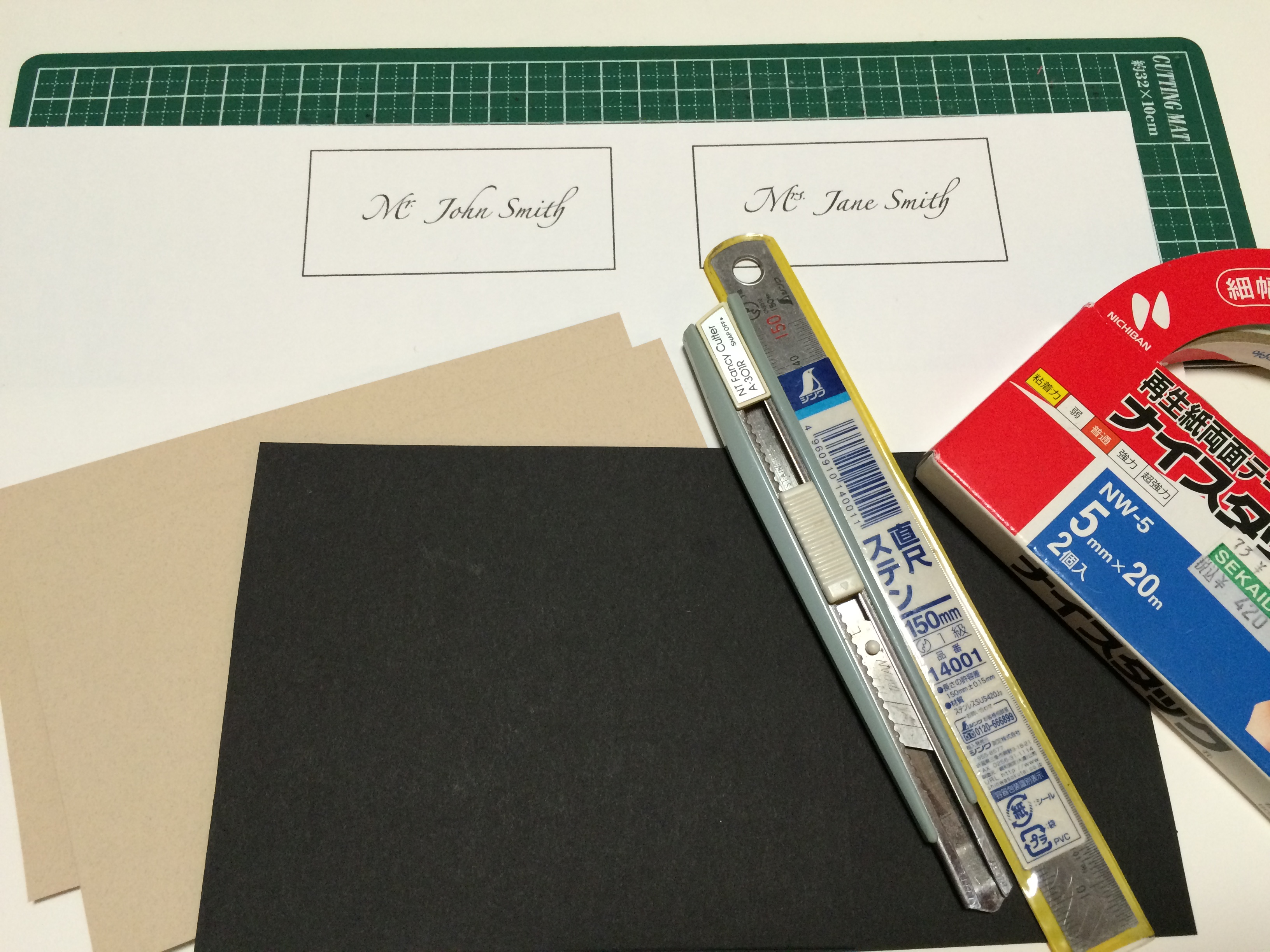
what you need / 材料:
card stock (optional: 2 types for front and back) / 厚紙または画用紙 (オプションとして表と裏で別々の紙を2種類)
printed names / 印刷されたネーム
cutting board / カッティングボード
cutter / カッター
(if available, a paper cutter will speed things up! pre-cut the names and card stock to size before hand (see below steps for sizes. front and back are the same size). / ペーパーカッターがあれば早いです!前もってネームと厚紙を人数分切り出しておくと、なお効率いいです。下記ステップに各サイズを表記しています。厚紙は、表裏共に同じサイズです。)
ruler / 定規
(i used a transparent sewing/patterning ruler (see step 1) to measure and cut simultaneously. / 透明のパターン用定規(ステップ1をご参照ください)を使うと測りながら切ることが出来て、スピードアップ出来ます。)
double stick tape / 両面テープ
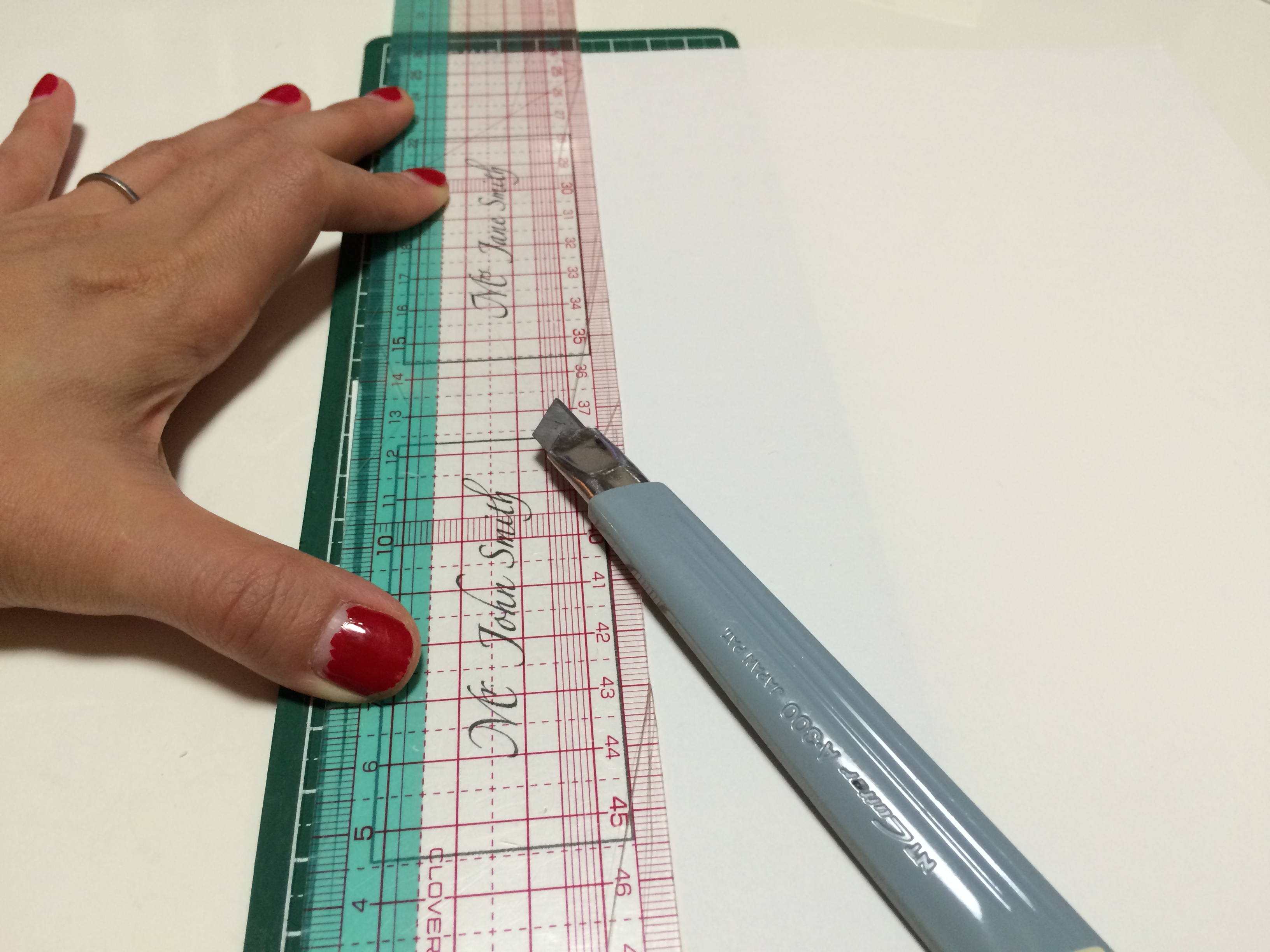
1. cut out the names to 8.7cm x 4.7cm/3 1/2in x 1 3/4in (i cut 5mm/1/8in around the rectangle using my patterning ruler). / 印刷されたネームを8.7cm×4.7cmに切る。(透明の定規を使って長方形の周り5mmでカットしました。)
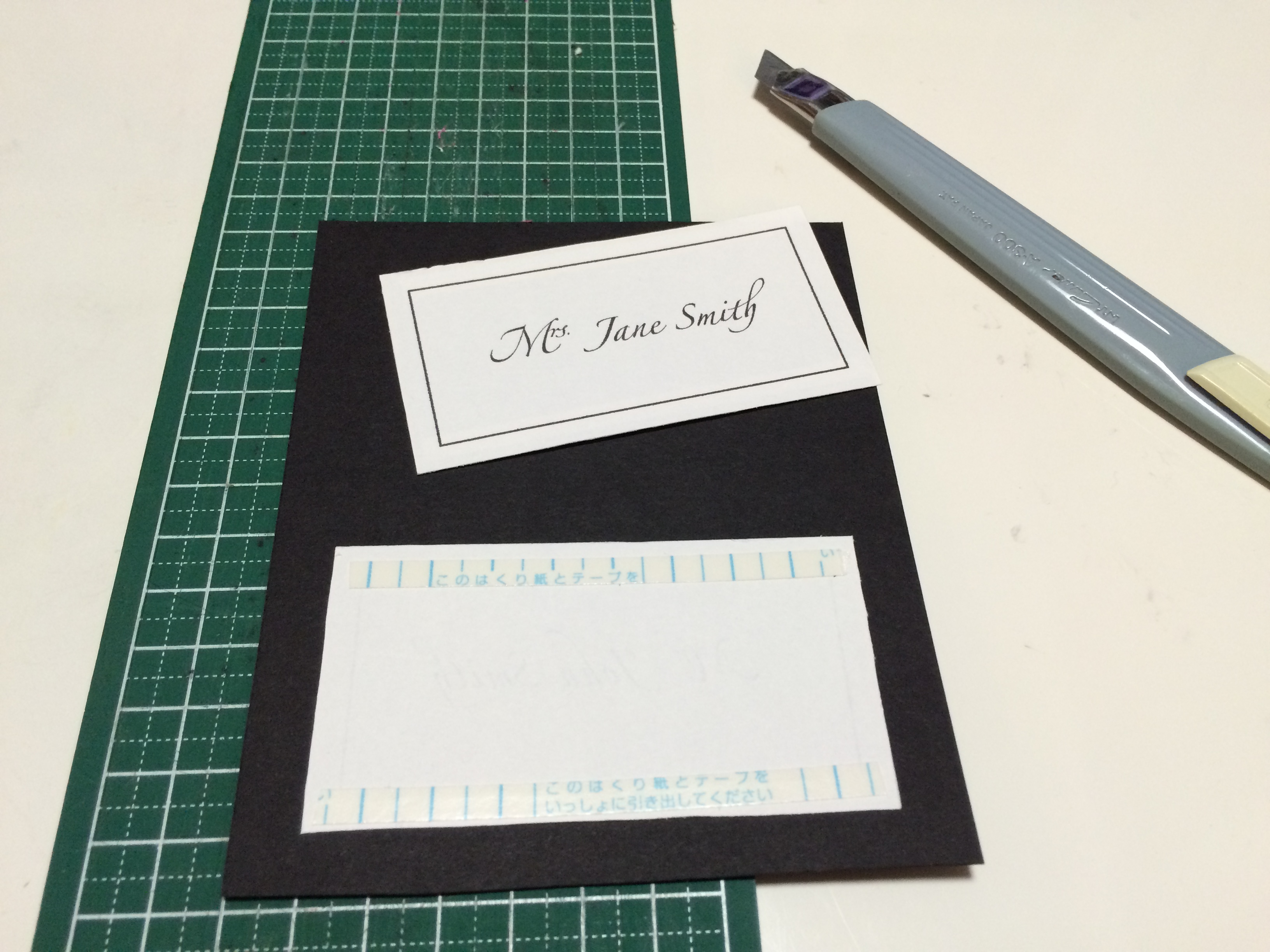
2. apply double stick tape to the backs of the names and apply to the center of the front card. / 両面テープをネームの裏に貼り、表になる厚紙の中心に貼る。
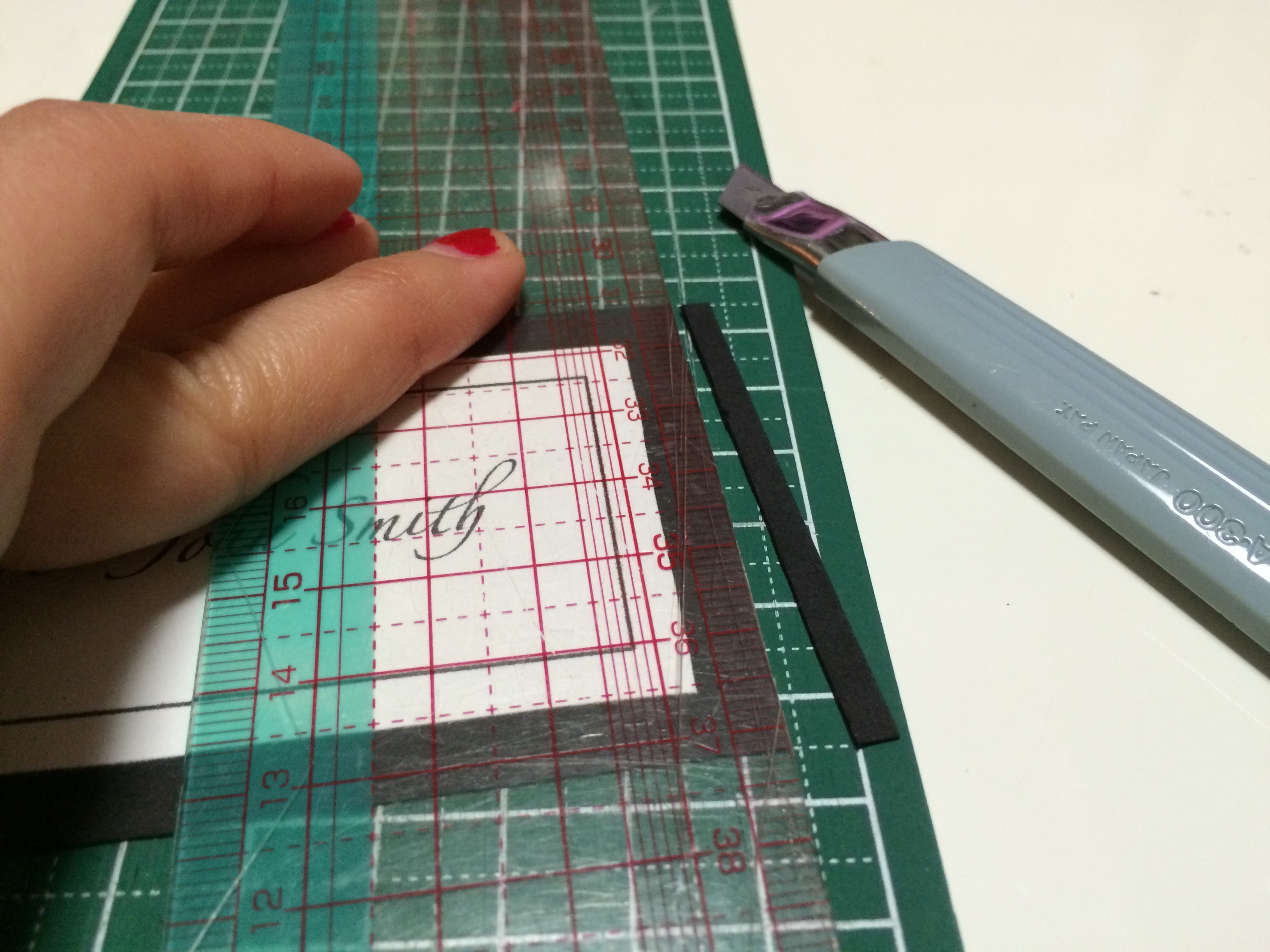
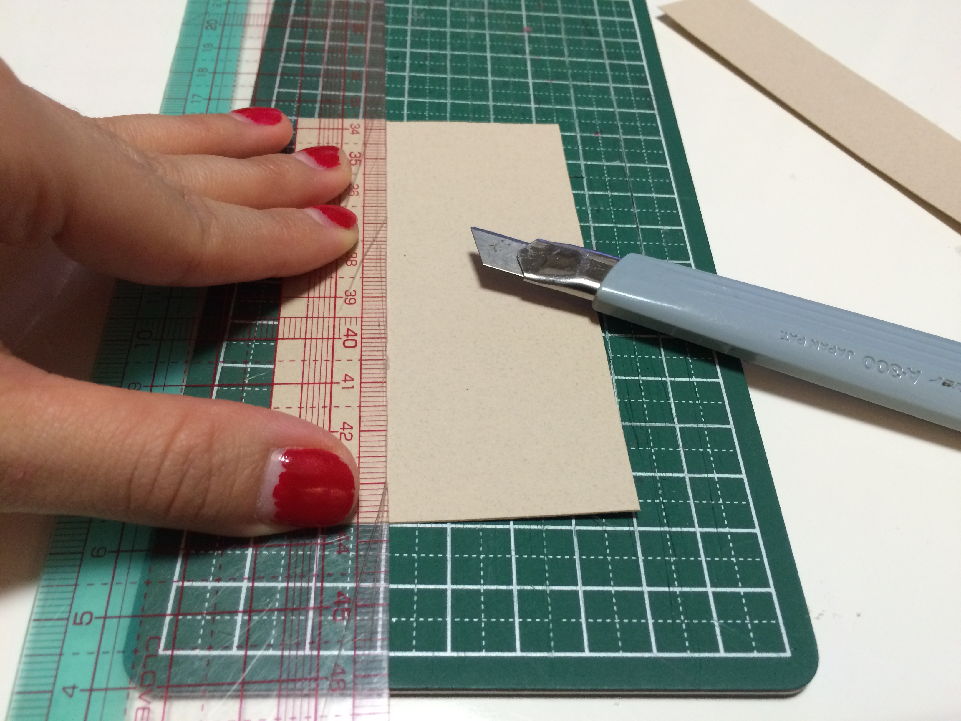
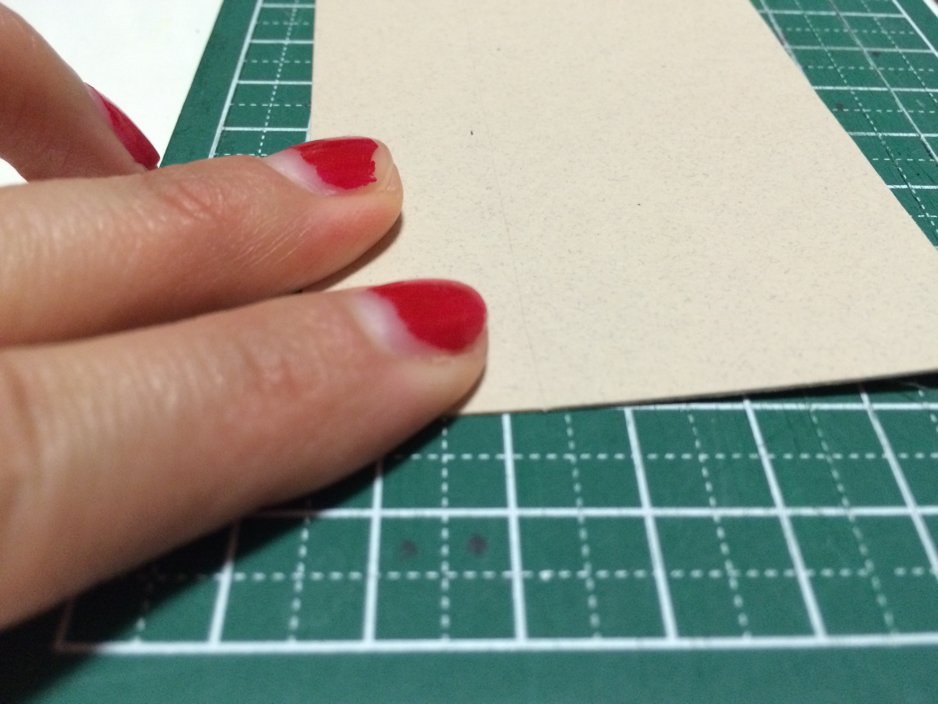
3. cut out the front card to 10cm x 6cm/4in x 2 3/8in (here i cut 7mm/1/4in around the name paper using the patterning ruler). / 表カードを10cm×6cmに切る。(透明定規を使用してネームの周囲7mmでカットしました。)
4. match the front card to a corner of the back card, and cut to the same size. / 裏紙の角に表カードを合わせ、表カードのサイズに合わせて切る。
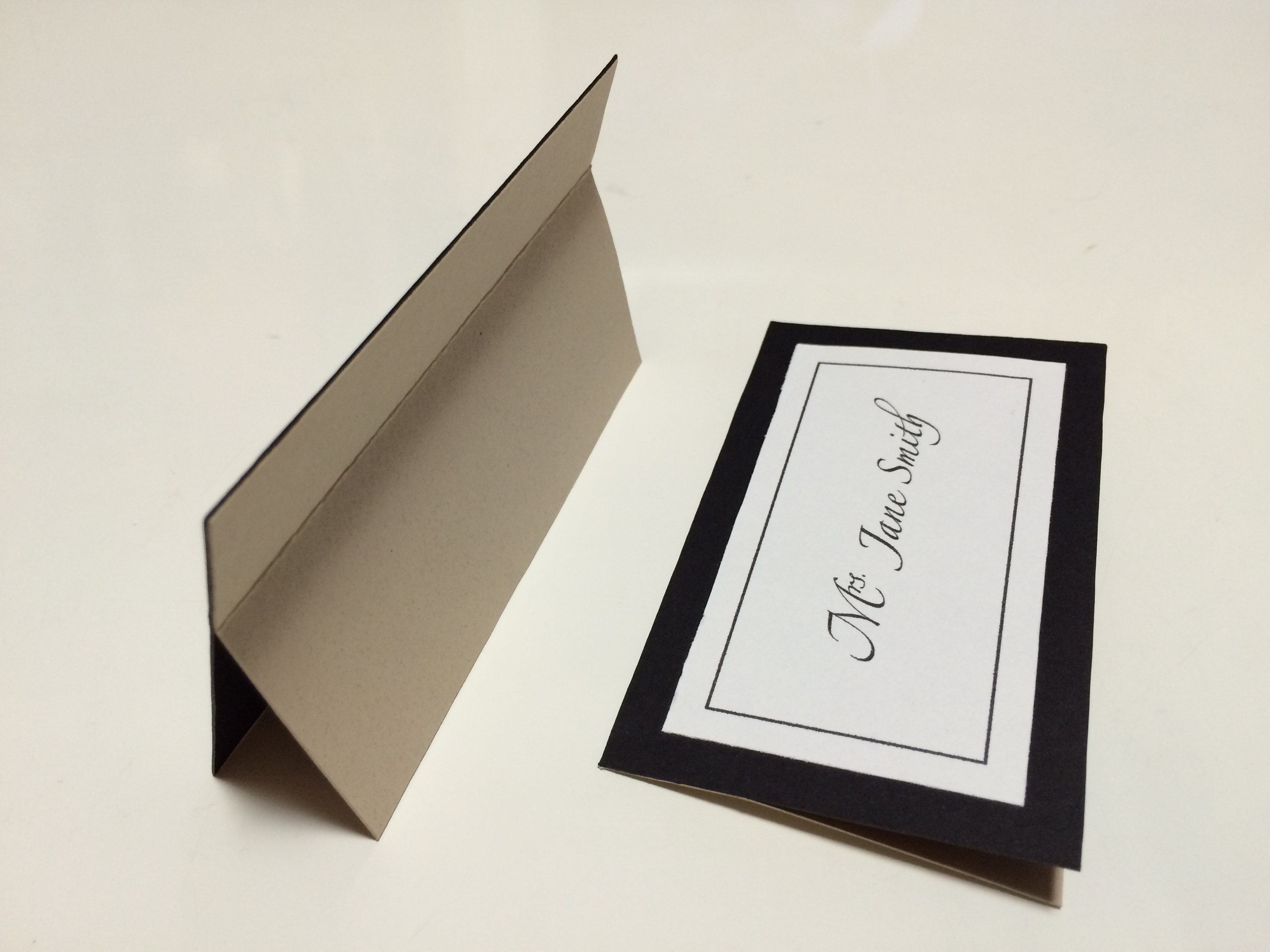
5. with a cutter, lightly score the back card 2cm/3/4in inside one of the longer sides. / カッターを使用して、裏カードを長い辺から2cm内側に軽〜く切り込みを入れる。
here’s a close up of the score. / 切り込みのアップ。これくらい軽くでいいのです!
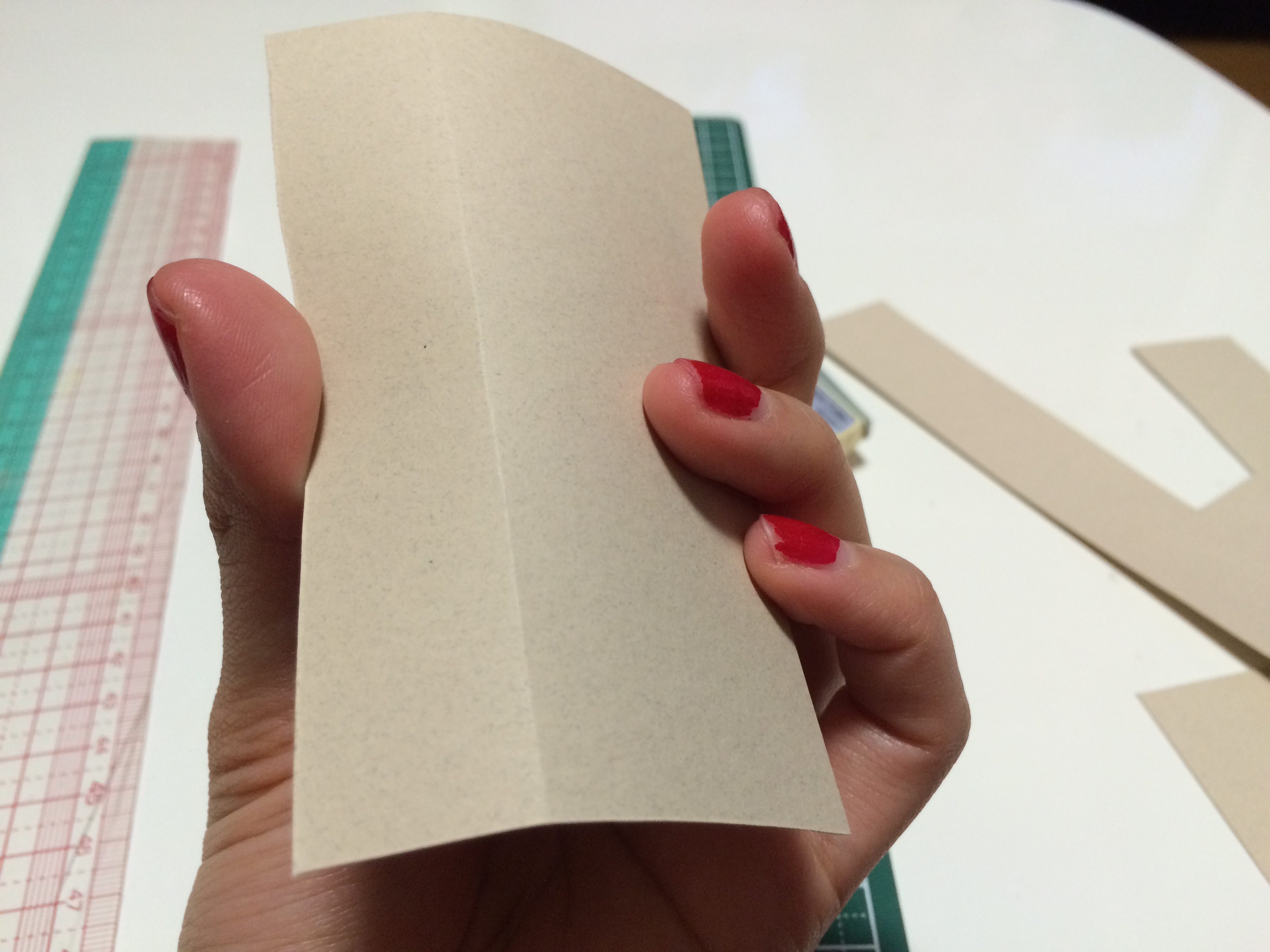
6. LIGHTLY fold score, with the cut side on the inside. / 優しく折り目を作る。切った面が内側の谷面になります。
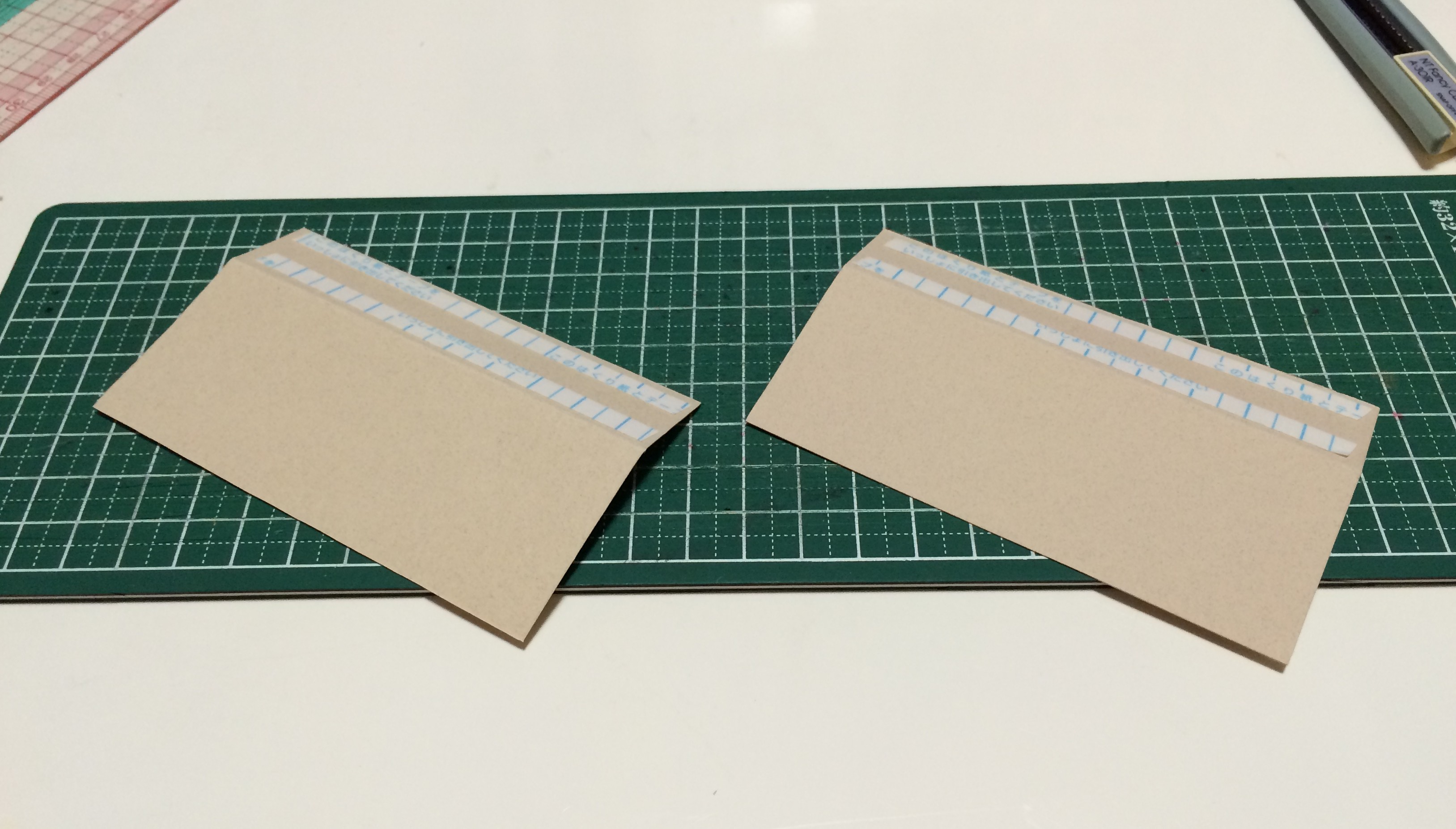
7. apply double stick tape to the thinner side of the score, again with the cut side facing down. / 山面になる側の細い部分に両面テープを貼る。
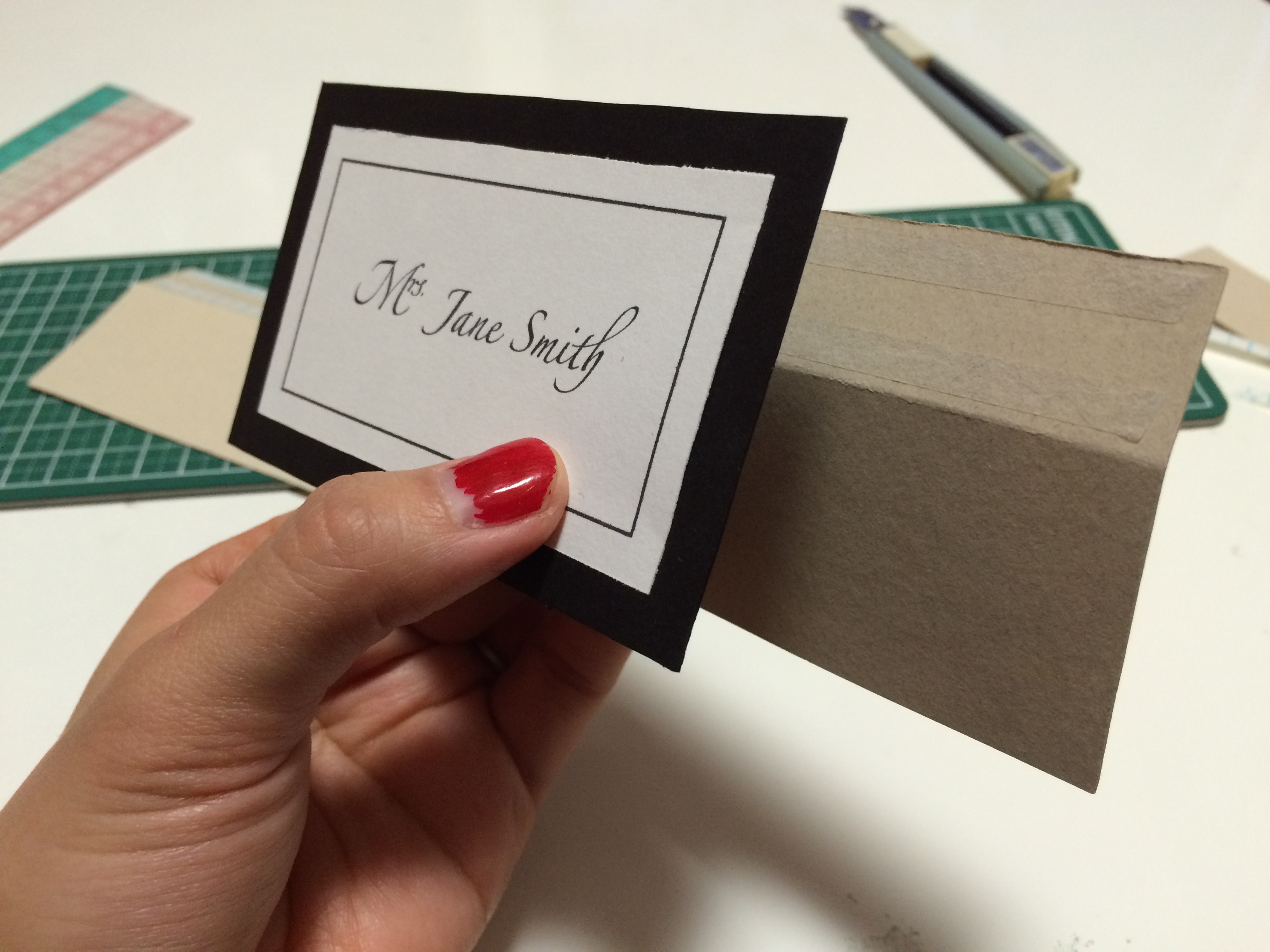
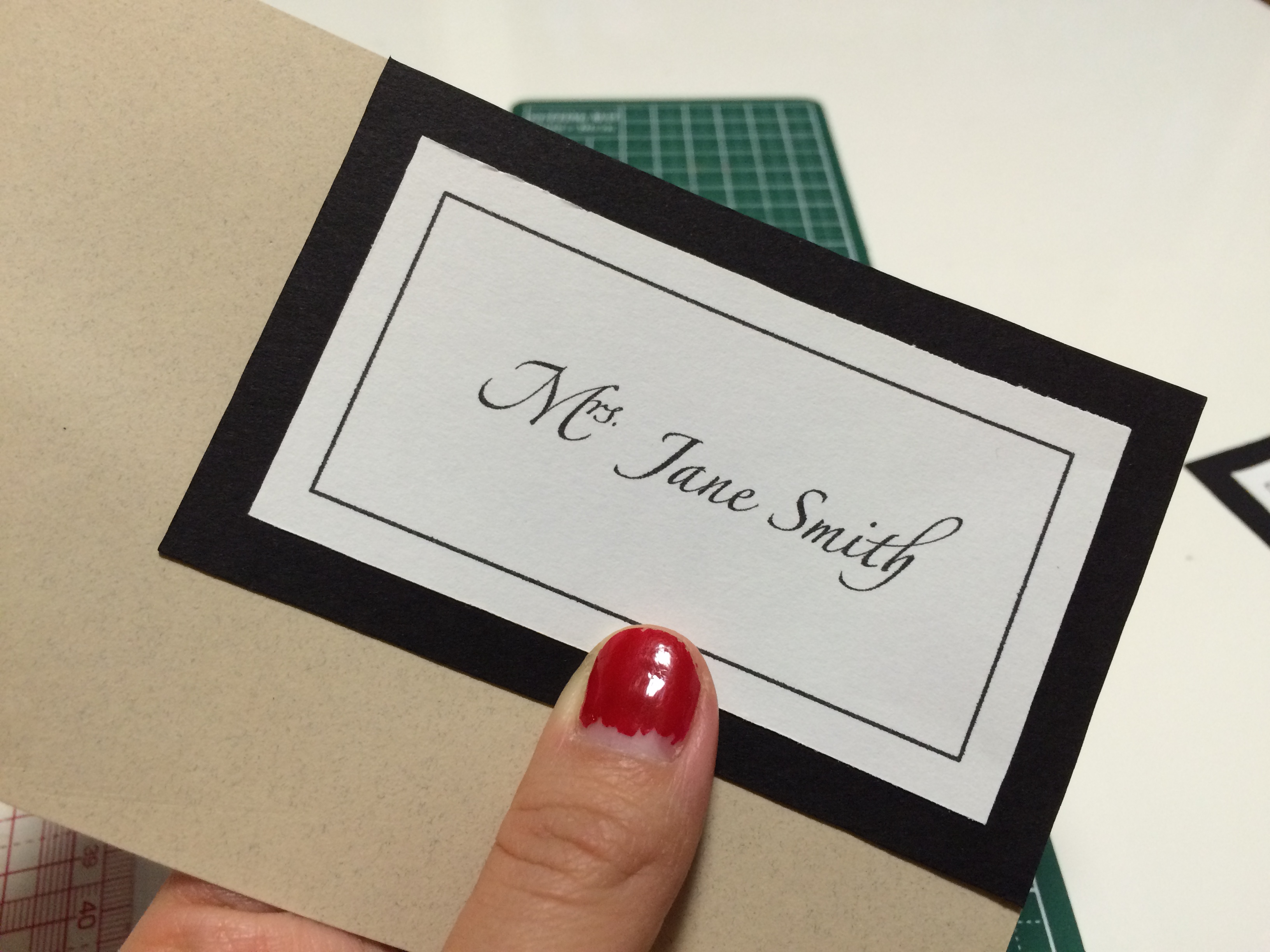
8. attach the backing to the front card, making sure that the name card is facing right-side up, and aligning the taped end to the top back side of the name card. / 裏カードを表カードと合体する。その際に、表カードのネーム面を手前に向け、裏カードのテープ面が表カードの裏の上端に合わさるように貼ります。
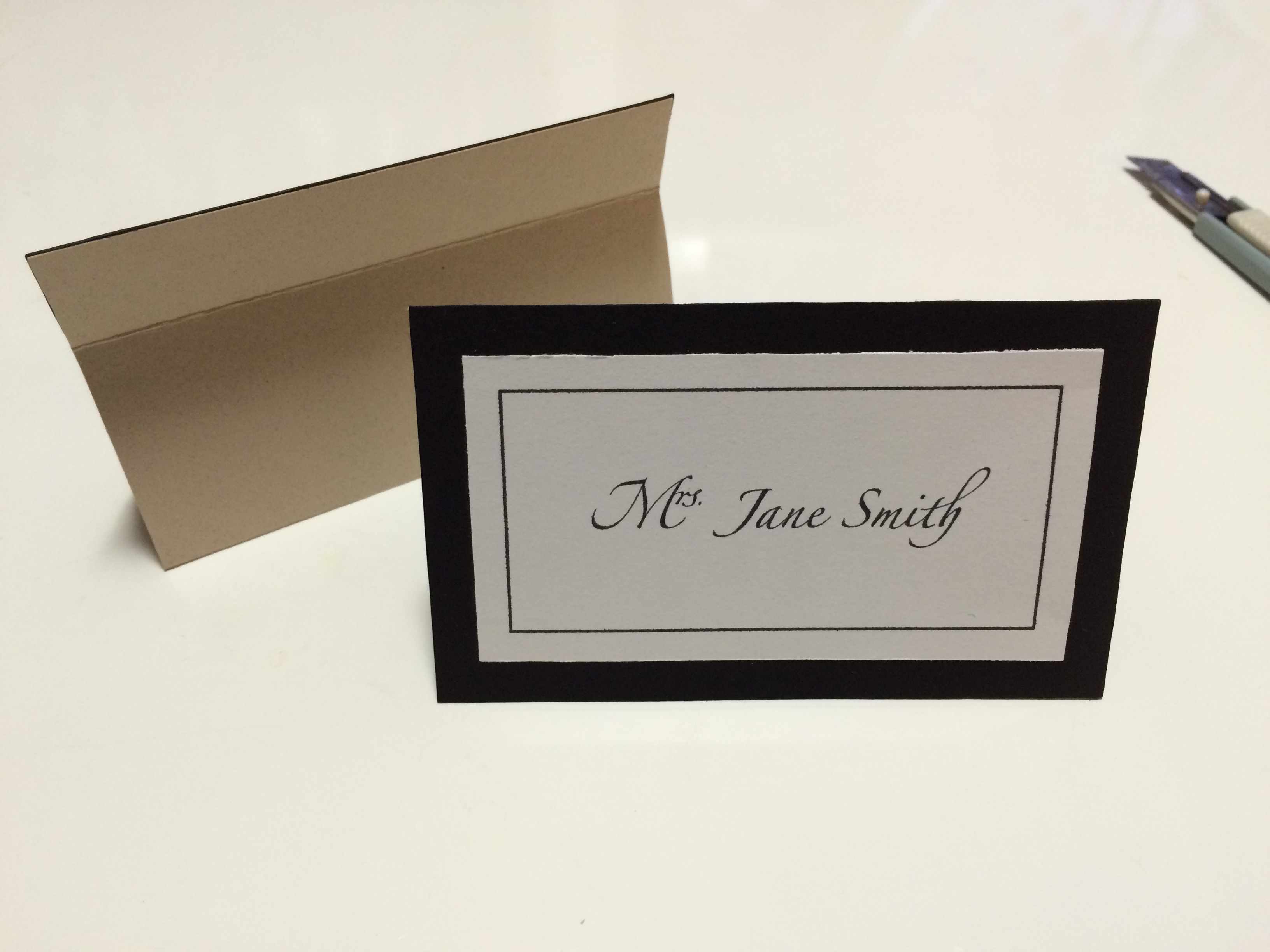
FINISHED! / 出来上がり!
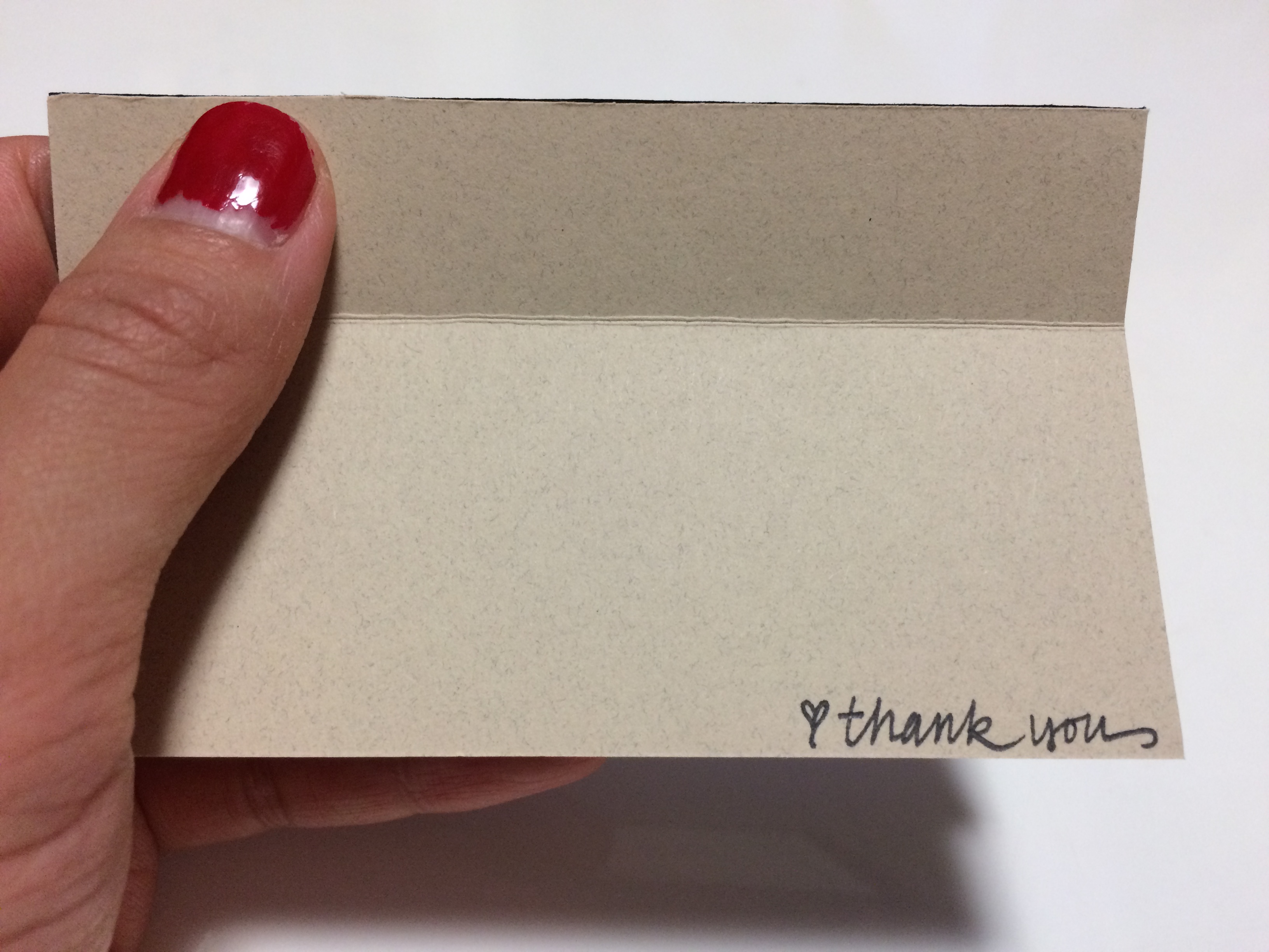
this name card is great because it is easily flattened to lessen the load to take to your wedding reception! / この席札は、平にしやすい上、最低限の場所をとるので披露宴の荷物を詰めやすくします!
[side note / ちなみに]
regarding my printer & paper for d.i.y. wedding paper items
d.i.y.ウェディングペーパーアイテムで使用しているプリンターと紙について
| my printer / プリンター |
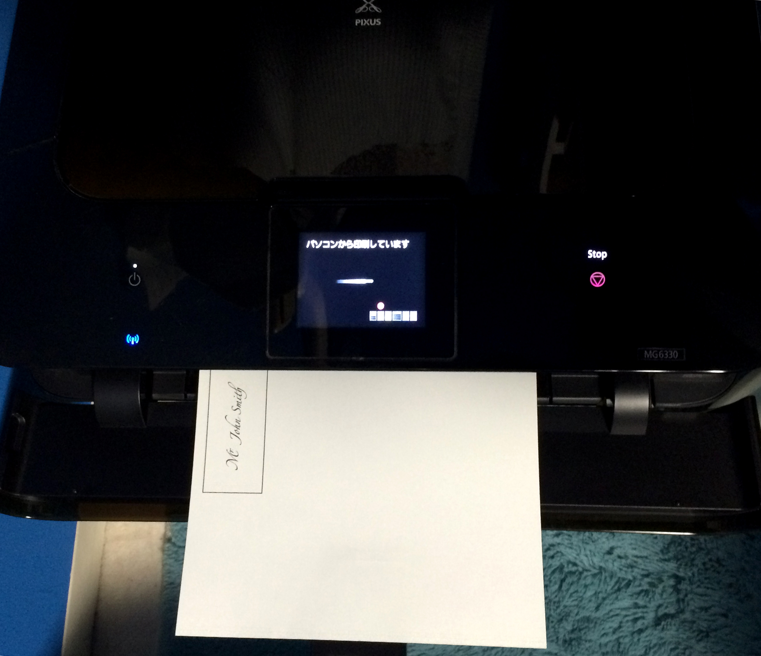
CANON PIXUS MG7530
an amazing purchase!! it prints both fine or fast, adjusts to many paper types, can print via wifi and from smart phones, and the quality is just great! for weddings, it’s best to print with a “fine printing” setting. it will look absolutely professional! / 重宝しています!ファインとスピーディで印刷設定を変えられ、様々な紙面に印刷できる上、wifiでスマホからも印刷できます。そして、何よりもクオリティが最高です!結婚式のためでしたら、ファイン設定がオススメです。
| araveal / アラベール |
MY FAVORITE. i recommend it to all my customers for it’s supple texture and matte look. since i take orders for making name placements, i have my own batch that i order from this online shop and my computer prints perfectly on it. / お客様にいつもオススメしている紙です。表面の凹凸がさりげなく、なめらかでマットに仕上がります。席札のご注文をいただいているので、takeopaperさんから発注して常備しています。自宅のプリンターでも綺麗に印刷されます。

![[FASHION TREND STUDY] S/S 2007 COLORS](http://www.peacelovetokyo.com/home/wp-content/uploads/2016/01/2007sscolors_edit1.jpg)
![[FASHION TREND STUDY] S/S 2007 COLORS](http://www.peacelovetokyo.com/home/wp-content/uploads/2016/01/2007sscolors_edit2.jpg)