
s+h logo wedding invitation
this week on the #tbt #fbf blog, i bring to you a custom logo wedding invitation. it was an absolute pleasure to work with this couple, as they share the same taste as myself when it comes to colors, fonts, and simplicity.
今回の #tbt #fbf ブログでは、オリジナルロゴのウェディング招待状をお送りします。こちらのウェディングの新郎新婦とは色味、フォントとシンプルさへの好みが共通しており、デザインするにあたってとても楽しく制作できました。
![[WEDDING] S+H LOGO WEDDING INVITATIONS](http://www.peacelovetokyo.com/home/wp-content/uploads/2015/04/FullSizeRender-2-400x300.jpg)
the key points of this invitation’s design / デザインのキーポイントは:
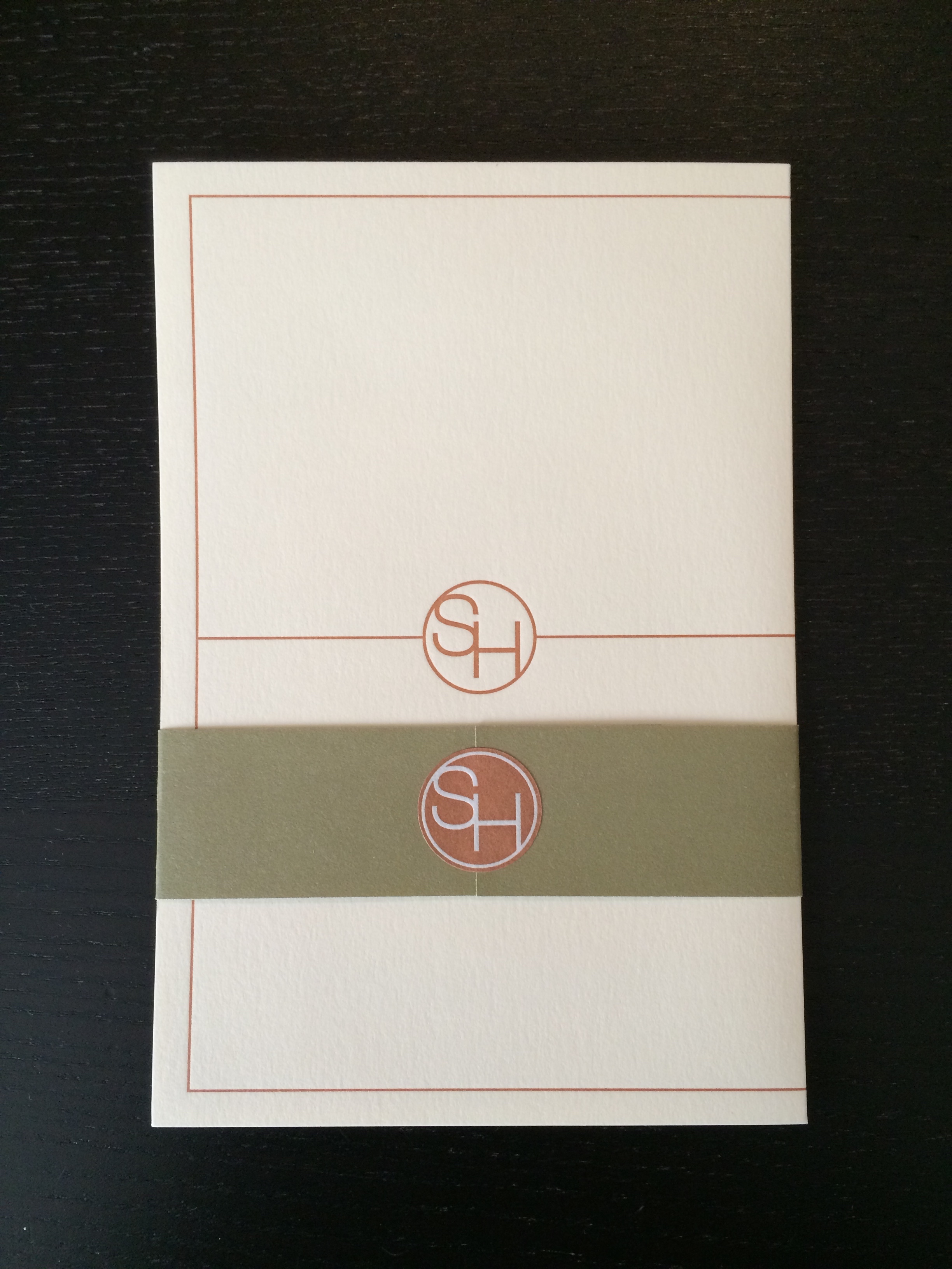
1. wedding colors: olive, orange, and natural colored paper
ウェディングカラー:うぐいす、橙色、ナチュラルな紙色
2. a letterpress friendly design (the main invitation is printed with letterpress)
活版印刷(招待状本状が活版印刷)
3. a simple logo for the “title” of their wedding “S+H”
“S+H” ウェディングのシンプルなロゴ
![[WEDDING] S+H LOGO WEDDING INVITATIONS](http://www.peacelovetokyo.com/home/wp-content/uploads/2015/04/IMG_41981-400x300.jpg)
![[WEDDING] S+H LOGO WEDDING INVITATIONS](http://www.peacelovetokyo.com/home/wp-content/uploads/2015/04/IMG_41971-300x400.jpg)
the couple loved the logo!! so they used it every chance they could throughout their wedding, which i will introduce in the coming weeks. since the actual invitation was printed in letterpress, i decided to take advantage of the depth and expanded the logo to cover the whole background of the inside. by using a lighter color, bolder line, and bigger size it allows the eye to focus on the front dimension (the invitation details).
お二人はロゴをすごく気に入ってくださって、ウェディングのいたるところでたくさん使用してくださいました(それはまた改めてご紹介いたします)!活版印刷で招待状本状を印刷しましたので、それを利用したデザインを考えました。背景に、薄く・太く・大きくロゴを使う事により、主張しすぎずに奥行きを出すことができます。
![[WEDDING] S+H LOGO WEDDING INVITATIONS](http://www.peacelovetokyo.com/home/wp-content/uploads/2015/04/FullSizeRender-400x290.jpg)
when i work with invitation sets, i like to think of how the entire set looks put together. each individual card is important on it’s own (and can have varying design elements), but it’s like an equation that needs to add up to 100 in terms of color, layout, and especially in this case, geometric elements.
招待状セットをデザインする際は、最終的に重ねた状態までを考えるのが重要だと考えています。一枚一枚のカードや付箋は大事な役目を果たしておりますが、組み合わせて『一つ』にならなければなりません。私は特にカラー、レイアウト、そして今回は図形的にもまとまるようにデザインをしております。