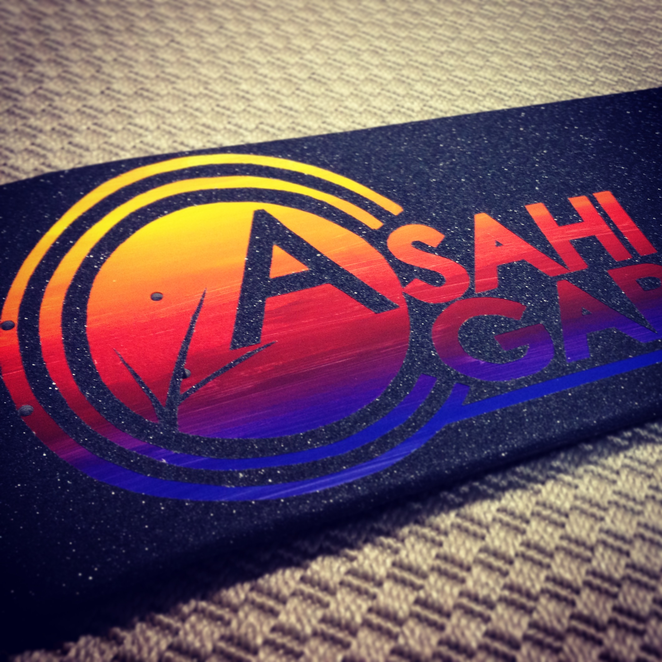
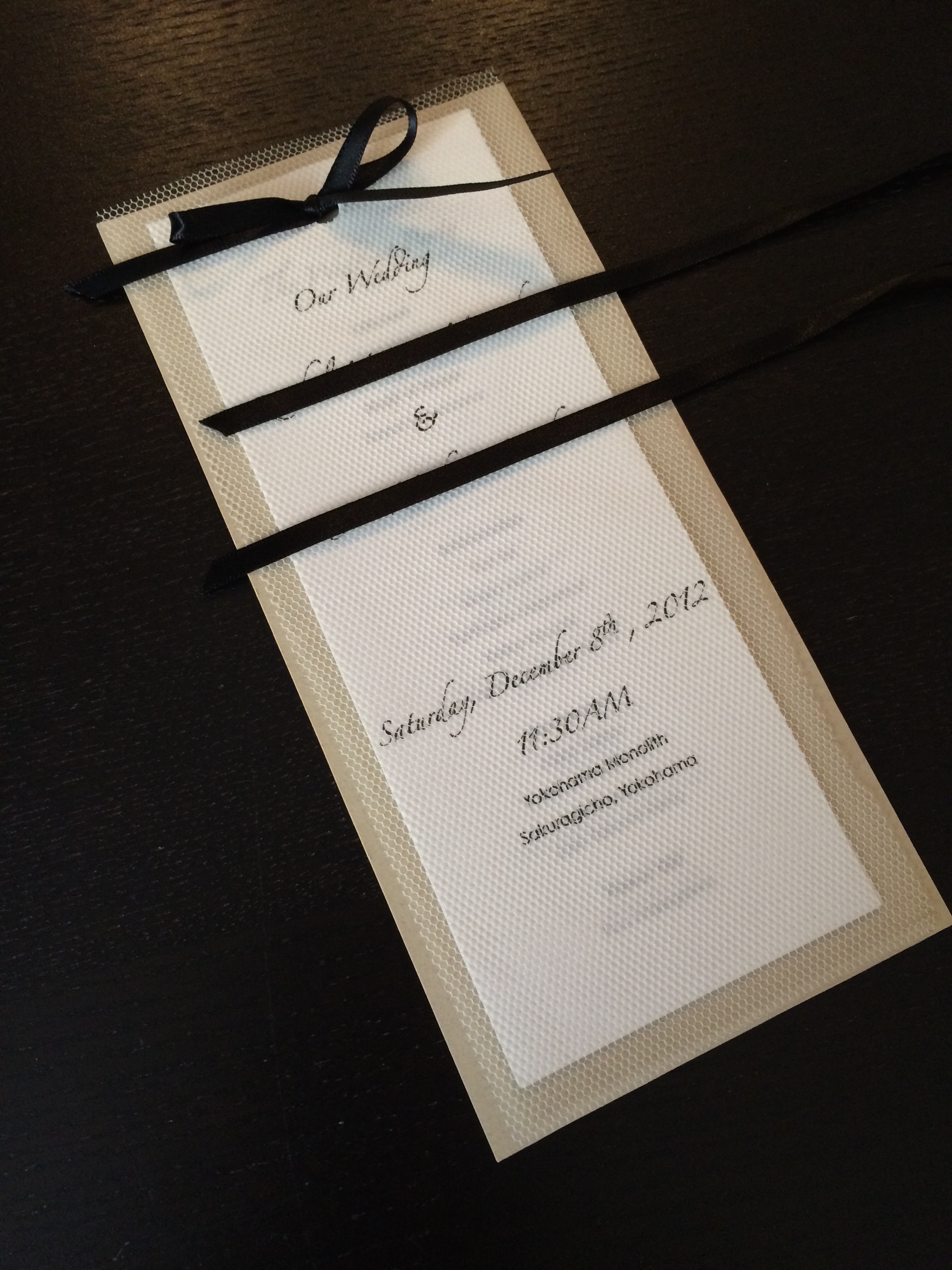
[d.i.y.] tulle veiled wedding programs
![[WEDDING] TULLE WEDDING PROGRAMS](http://www.peacelovetokyo.com/home/wp-content/uploads/2015/03/IMG_4188-300x400.jpg)
i introduced this “tulle veiled wedding program” on one of my #tbt #fbf posts last month. on this post, i will show you how to make it yourself! i recommend this especially if you’re in your wedding crunch time. to make this program from printing -> cutting the paper and tulle, to tying the ribbon, it took me a total of 30 minutes.
以前に #tbt #fbf の書き込みでこちらの「チュールベールのウェディングプログラム」をご紹介いたしました。今回は、こちらをご自身で作れる d.i.y. をご説明いたします。特にご結婚式の最終段階でお急ぎの場合は特におすすめの d.i.y. です!印刷から紙とチュールの裁断、リボンを結ぶまでかかった時間は30分!
LET’S START! / 始めよう!
what you need / 材料:
any A4 size printing paper / お好みのA4サイズ印刷用紙
card stock (9cm × 22.75cm) / カード紙 (9cm × 22.75cm)
tulle (9cm × 22.75cm) / チュール (9cm × 22.75cm)
scissors / ハサミ
ruler / 定規
hole puncher (i used a 3mm hole, up to 5mm is fine) /
穴あけパンチ (今回は、3mmの穴を使用しましたが、5mmまで可能)
5mm width ribbon (45cm) / 5mm幅リボン (45cm)
![[d.i.y.] tulle veiled wedding programs-1](http://www.peacelovetokyo.com/home/wp-content/uploads/2015/04/FullSizeRender1-400x300.jpg)
1. create your text on a spreadsheet application using landscape orientation. each individual page should measure 7.5cm × 21cm, which means 3 pages can fit on 1 A4 size page. print.
テキストをスプレッドシートアプリケーションなどを使用して、横向きで作成する。1枚1枚のページサイズが 7.5cm × 21cm になるように、アプリケーション上でA4サイズに3枚のページを横に並べる。印刷する。
![[d.i.y.] tulle veiled wedding programs-2](http://www.peacelovetokyo.com/home/wp-content/uploads/2015/04/IMG_4835-2-341x400.jpg)
2. card stock should be cut to 9cm × 22.75cm. then, cut A4 size printed text into individual pages measuring to 7.5cm × 21cm.
カード紙は 9cm × 22.75cm にカットし、A4 用紙は 7.5cm × 21cm のページに切り分ける。
![[d.i.y.] tulle veiled wedding programs-3](http://www.peacelovetokyo.com/home/wp-content/uploads/2015/04/IMG_4836-300x400.jpg)
3. cut tulle to the same size as card stock.
チュールはカード紙と同じサイズに合わせて切る。
![[d.i.y.] tulle veiled wedding programs-4](http://www.peacelovetokyo.com/home/wp-content/uploads/2015/04/IMG_4837-2-400x295.jpg)
4. place tulle and program pages as shown in photo. the top of the pages should be placed 0.6cm away from the edge of the tulle. punch a hole 1cm from the top of the pages and horizontally in the center. if possible, it is more efficient to punch a hole through the pages and tulle all in one go.
プログラムのページとチュールを写真のように重ねる。ページの上端から1cm、横幅の中心位置に穴をあける。可能であれば、チュールと紙をいっぺんに穴あけしますと効率よく、綺麗に仕上がりやすいと思います。
![[d.i.y.] tulle veiled wedding programs-5](http://www.peacelovetokyo.com/home/wp-content/uploads/2015/04/IMG_4838-2-400x300.jpg)
5. mark and punch two holes in the card stock. 1.7cm away from the top, 3cm apart.
カード紙に穴を2つ開ける。上端から1.7cm、3cm間隔で。
![[d.i.y.] tulle veiled wedding programs-6](http://www.peacelovetokyo.com/home/wp-content/uploads/2015/04/IMG_4839-e1429029131881-400x300.jpg)
6. prepare 45cm length ribbon. / 45cmのリボンを用意する。
![[d.i.y.] tulle veiled wedding programs-7](http://www.peacelovetokyo.com/home/wp-content/uploads/2015/04/IMG_4842-e1429029098426-400x300.jpg)
7. this is the last step! pull the ribbon evenly through the two holes of the card stock. then pull the ribbon through the single hole of the program pages, then tulle cover.
最後のステップです!カード紙の2つの穴にリボンを通し、続けてページとチュールの1つの穴に通す。
![[d.i.y.] tulle veiled wedding programs-8](http://www.peacelovetokyo.com/home/wp-content/uploads/2015/04/IMG_4843-e1429029113662-300x400.jpg)
8. make sure to pull the ribbon all the way through and evenly!
リボンはきつめに引っ張ってカード紙から通したリボンが平行になっていることを確認。
![[d.i.y.] tulle veiled wedding programs-9](http://www.peacelovetokyo.com/home/wp-content/uploads/2015/04/IMG_4844-400x300.jpg)
9. tie the ribbon and voila! / リボンを結んで完成!
FINISHED!
![[WEDDING] NATURAL BI-FOLD WEDDING PROGRAM](http://www.peacelovetokyo.com/home/wp-content/uploads/2015/04/IMG_4192-400x300.jpg)
![[WEDDING] NATURAL BI-FOLD WEDDING PROGRAM](http://www.peacelovetokyo.com/home/wp-content/uploads/2015/04/IMG_4193-400x300.jpg)
![[WEDDING] NATURAL BI-FOLD WEDDING PROGRAM](http://www.peacelovetokyo.com/home/wp-content/uploads/2015/04/IMG_4194-300x400.jpg)
![[WEDDING] TULLE WEDDING PROGRAMS](http://www.peacelovetokyo.com/home/wp-content/uploads/2015/03/IMG_4189-300x400.jpg)
![[WEDDING] TULLE WEDDING PROGRAMS](http://www.peacelovetokyo.com/home/wp-content/uploads/2015/03/IMG_4190-300x400.jpg)
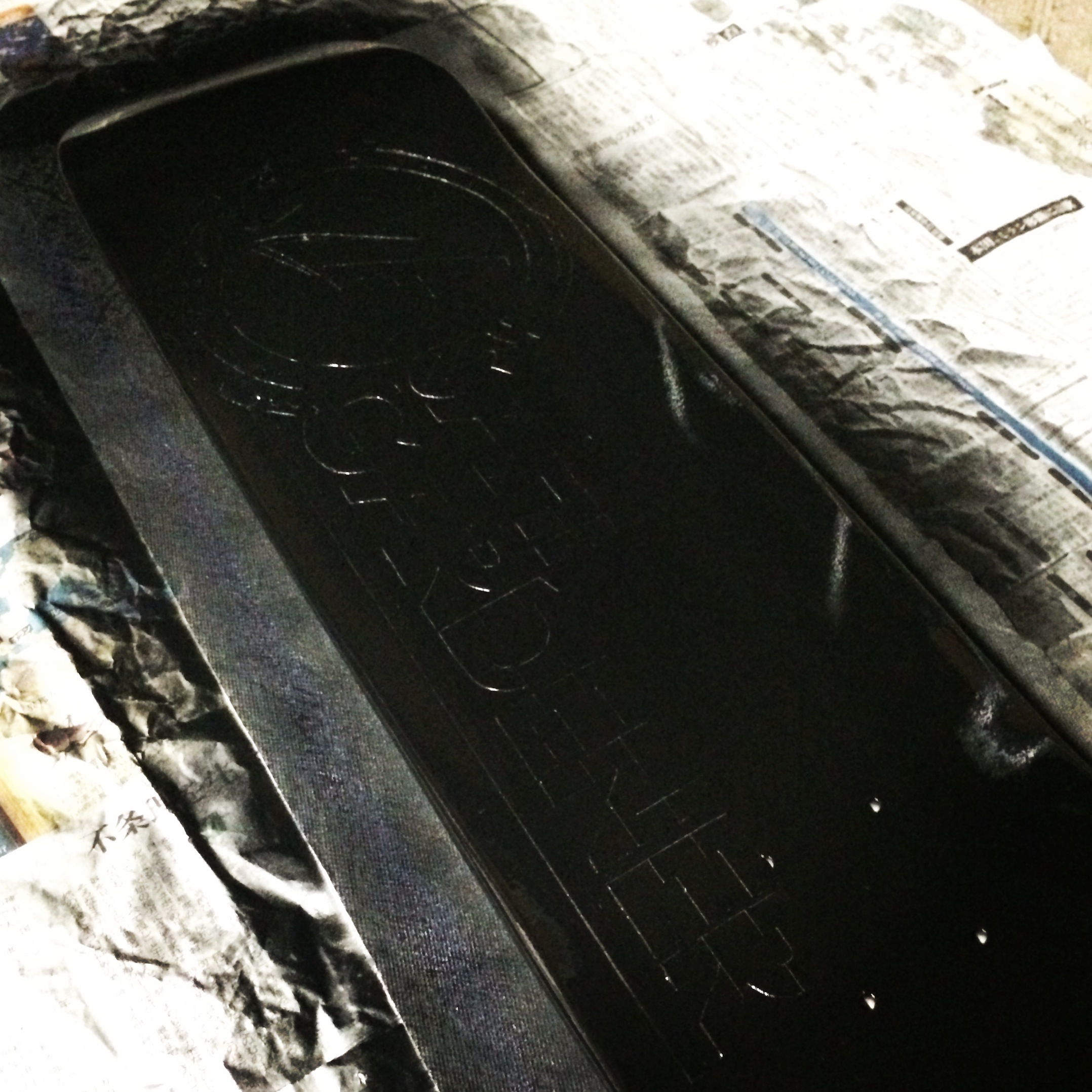
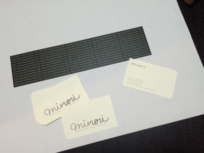
![[WEDDING] BLACK AND WHITE INVITATIONS CONTENTS](http://www.peacelovetokyo.com/home/wp-content/uploads/2015/03/IMG_4182-400x300.jpg)
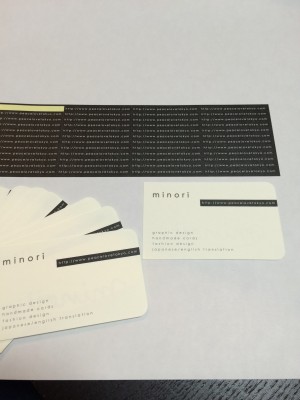
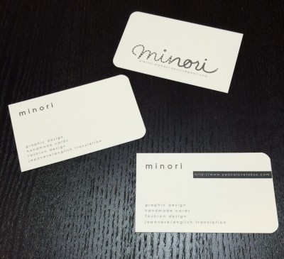
![[WEDDING] BLACK AND WHITE INVITATIONS](http://www.peacelovetokyo.com/home/wp-content/uploads/2015/03/IMG_4184-400x300.jpg)
![[WEDDING] BLACK AND WHITE INVITATIONS](http://www.peacelovetokyo.com/home/wp-content/uploads/2015/03/IMG_4186-400x300.jpg)
![[WEDDING] BLACK AND WHITE INVITATIONS CONTENTS](http://www.peacelovetokyo.com/home/wp-content/uploads/2015/03/IMG_4183-400x300.jpg)
![[WEDDING] BLACK AND WHITE INVITATIONS](http://www.peacelovetokyo.com/home/wp-content/uploads/2015/03/IMG_4181-300x400.jpg)
![[GRAPHIC DESIGN] 2015 NEW YEAR'S POST CARD](http://www.peacelovetokyo.com/home/wp-content/uploads/2015/03/IMG_3485-300x400.jpg)
![[GRAPHIC DESIGN] 2015 NEW YEAR'S POST CARDS](http://www.peacelovetokyo.com/home/wp-content/uploads/2015/03/IMG_3484-300x400.jpg)